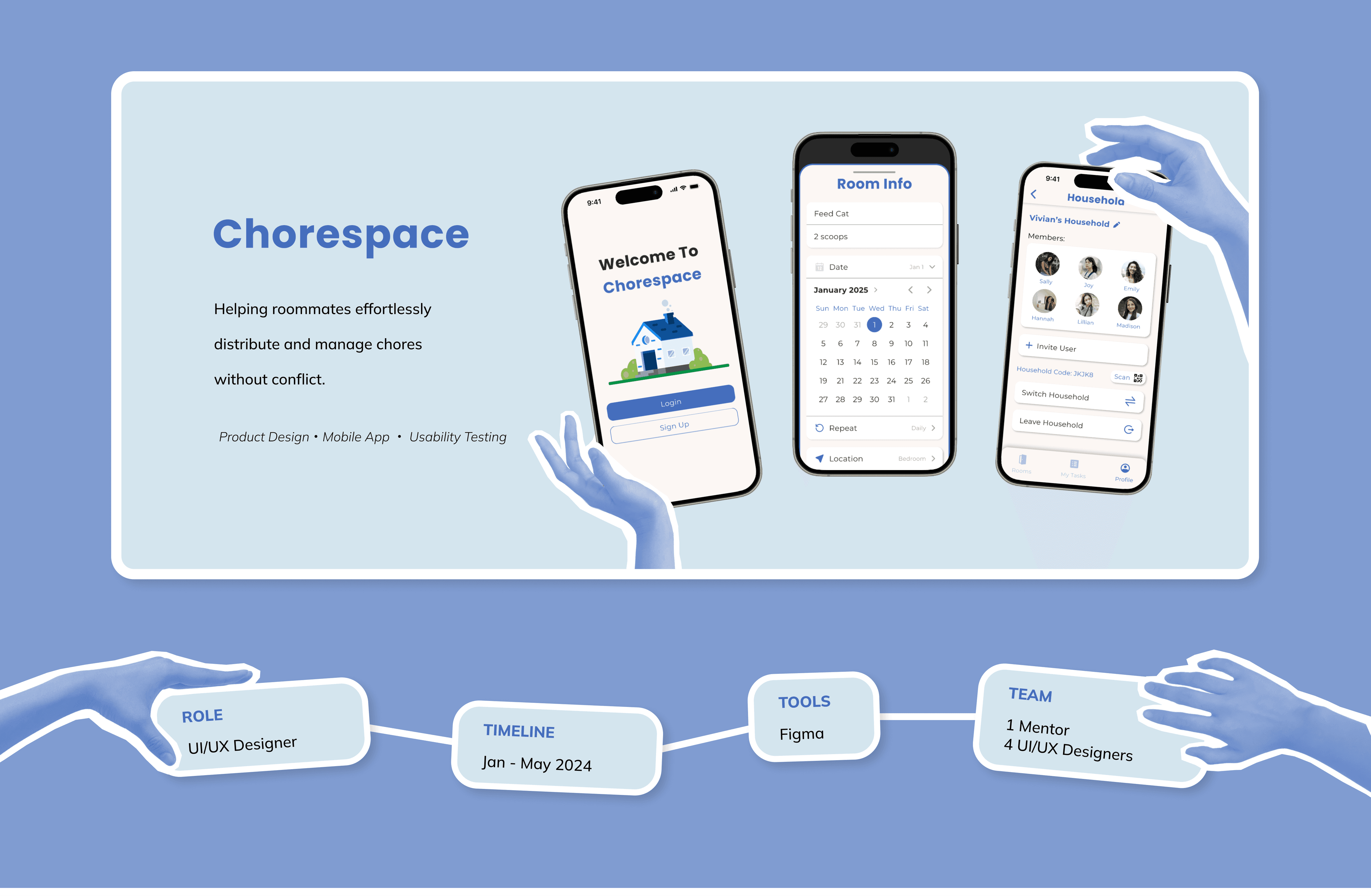
Overview
THE PROBLEM
Unfair chores. Irresponsible roommates.
At UC San Diego, many of our peers would frequently complain about unfairly distributed chores, irresponsible roommates, and general conflicts that would arise in shared living situations.
SEVERITY
Many. Many. Many. Complaints.
“People don’t pick up their stuff & clean it. Its an issues because it piles up and smells. Happens every week” - Daisy
“My best friend and I used to get mad at each other for not throwing out the trash...then we found out it was the other guy.” - Rohan
“I have to remind my roommate when it's his turn because he doesn't remember. It only takes one or two times but its annoying” -Issac
“We don't have a system in place to assign chores. Its impossible to get any necessary tasks completed.” - Connie
These complaints would often lead to conflicts, stress, and frequent disputes. Something as simple as trash being taken out a day late, or the floor being a little dirty causes confusion, resentment, and negativity. This imbalance can leave overburdened students with less time for academics, negatively affecting their grades, relationships, and mental health, often leading to burnout and reduced motivation.
OUR SOLUTION
Creating an easy, effective system.
With the intention of tackling these pain points and developing a solution to alleviate this prevalent issue, we created a mobile app that allows users to manage chores while ensuring accountability through conflict-preventative measures.
MY CONTRIBUTION
Designing for Different Households.
As a designer on the team, I was in charge of creating wireframes, high-fidelity designs, and prototypes for the profile page of Chorespace. I collaborated with my team to conduct research and consolidate findings to inform our design choices. I also conducted A/B testing with users regarding household features, which influenced my designs for V2.
OUR OBJECTIVES
Customizability. Accountability. Proactiveness.
We aim to...
Offer customizable chore assignments.
Track chores clearly and ensure accountability.
Prevent conflicts before they arise.
Solution Preview

Onboarding
Sign up/Login
Create custom household with different custom rooms
Join household via scanning QR code
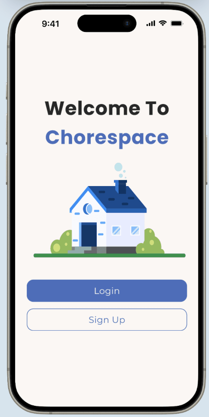
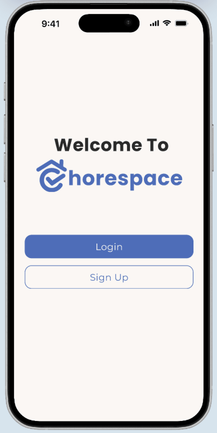
Custom vector image for branding
Home Page
Filter options for tasks
View all notifications
Add & edit tasks
Complete task
Nudge feature for personal tasks


Rooms Page
Customize rooms
Edit tasks within rooms
Incomplete tasks displayed visibly
Drag-and-drop feature to reorder rooms
Profile Page
Edit personal information
All task history
Switch & leave & edit household(s)
Notifications settings
Password settings
Empathize
Define
Ideate
Prototype
Test
PRIMARY RESEARCH
User Research.
To influence our designs, we gathered insights directly from our primary users: college students. We conducted qualitative research by sending out a survey that received 22 responses and quantitative research through interviews.
1
Qualitative
22 Surveys
2
Quantitative
5 Interviews
Our questions aimed to understand users' satisfaction with their current distribution systems: effectiveness, accountability, conflict resolution, and motivation factors. Through this research, we identified user pain points and discovered areas of improvement.
KEY ISSUES
Existing Systems Are Not Effective.
Through surveys, we discovered that only 45% of students had existing chore distribution systems and out of that 45%, more than 77% were dissatisfied with their current system. We also discovered was that out of the small group of students who reported their system as satisfactory, 60% of those satisfied students actually did not even have a chore distribution system in place.
OUR QUESTIONS
77% dissatisfied.
Why are students dissatisfied?
What are main pain points?
How can we address these issues?
More satisfaction without system.
Why is no system more satisfactory?
What does this mean?
How can we help?
OUR ANSWERS
Luck And Heavy Reliance On Being Proactive.
“We just kinda do stuff when we feel like it, one of us usually steps up before it gets too bad.” - Miles
“Everyone does their own stuff pretty well except one guy whom everyone has to clean up after. Other than that its fine.” - Rohan
“Everybody in the apartment pulls their weight and cleaning together makes the task more enjoyable.” - Connie
“I do all the chores when I see them. I’m usually the one who does it, not really anyone else.” - Anonymous
Upon analyzing our survey results further, we found that dissatisfaction stemmed from a lack of proactiveness, while satisfaction was linked to high levels of proactiveness. Students who were satisfied without centralized management systems depended heavily on everyone being on the same page. This same proactiveness cannot be guaranteed across all living arrangements. We need to consider all types of students when making a system that works.
AFFINITY MAP
Consolidate Findings.
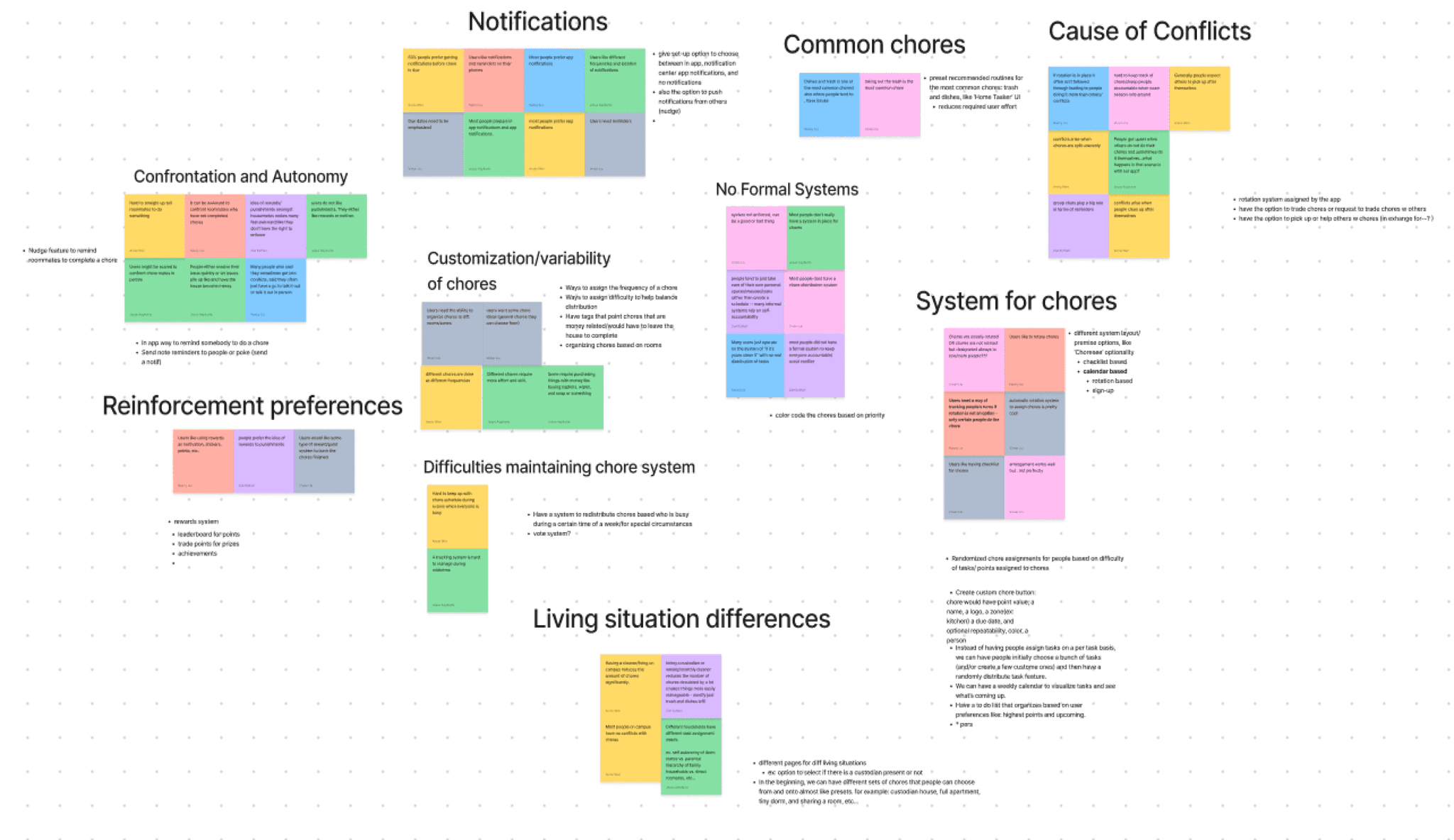
With these answers in mind, we used an affinity map to consolidate our survey findings. By grouping common themes found through our user responses, we were able to extract key pain points which guided the design of our app features.
KEY INSIGHTS
What We Discovered.
1
Issue: Uneven chore distribution + Difficulties in upholding a chore system.
Solution: Implement a rotation system assigned by the app.
2
Issue: Differences in living situations + Excessive chore variability.
Solution: Introduce customized room tags for different chore assignments.
3
Issue: Dislike of direct confrontation + Varying reinforcement preferences.
Solution: Nudge feature to encourage task completion without confrontation.
SECONDARY RESEARCH
Competitor Analysis.
In addition to user research, we also conducted a competitor analysis, examining existing chore management apps like Home Routines, Sweepy, Tody, and Chorsee to identify successful existing features and areas for improvement.
Home
Routines

Sweepy

Tody

Chorsee
KEY ISSUES
What We Discovered.
1
Outdated
2
Lacking
Accountability
3
Misaligned
While there were some aspects of each app that we liked, none of the competition addressed our problem full on. Either the app was outdated, lacked accountability, or too childish for college students. In conclusion, there was no app currently available to download that would alleviate all of our primary target user group’s main pain points.
Empathize
Define
Ideate
Prototype
Test
Problem Statement
How can we help college students effortlessly assign chores and ensure accountability?
Empathize
Define
Ideate
Prototype
Test
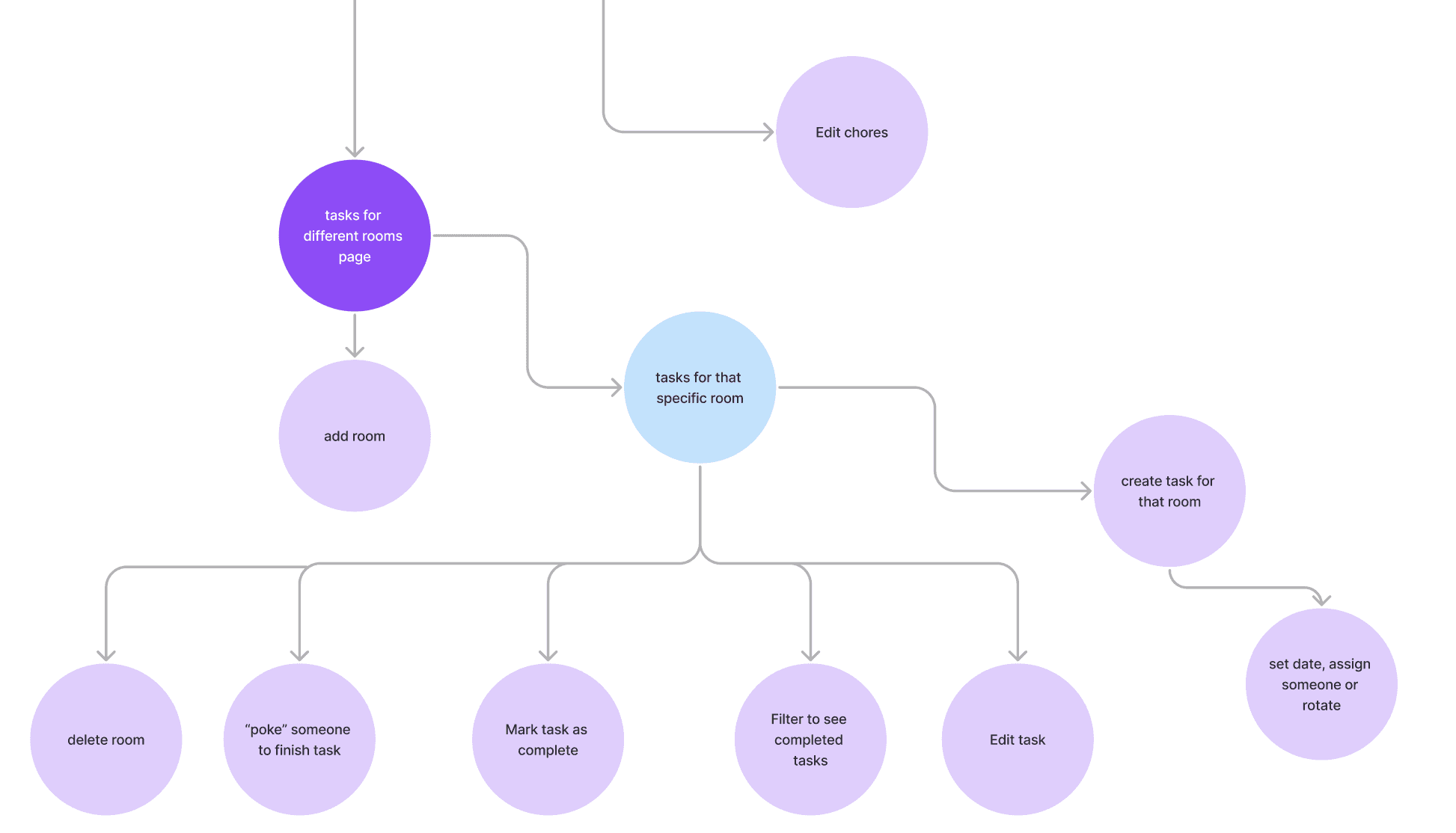
USER FLOW
Map out the User Journey.
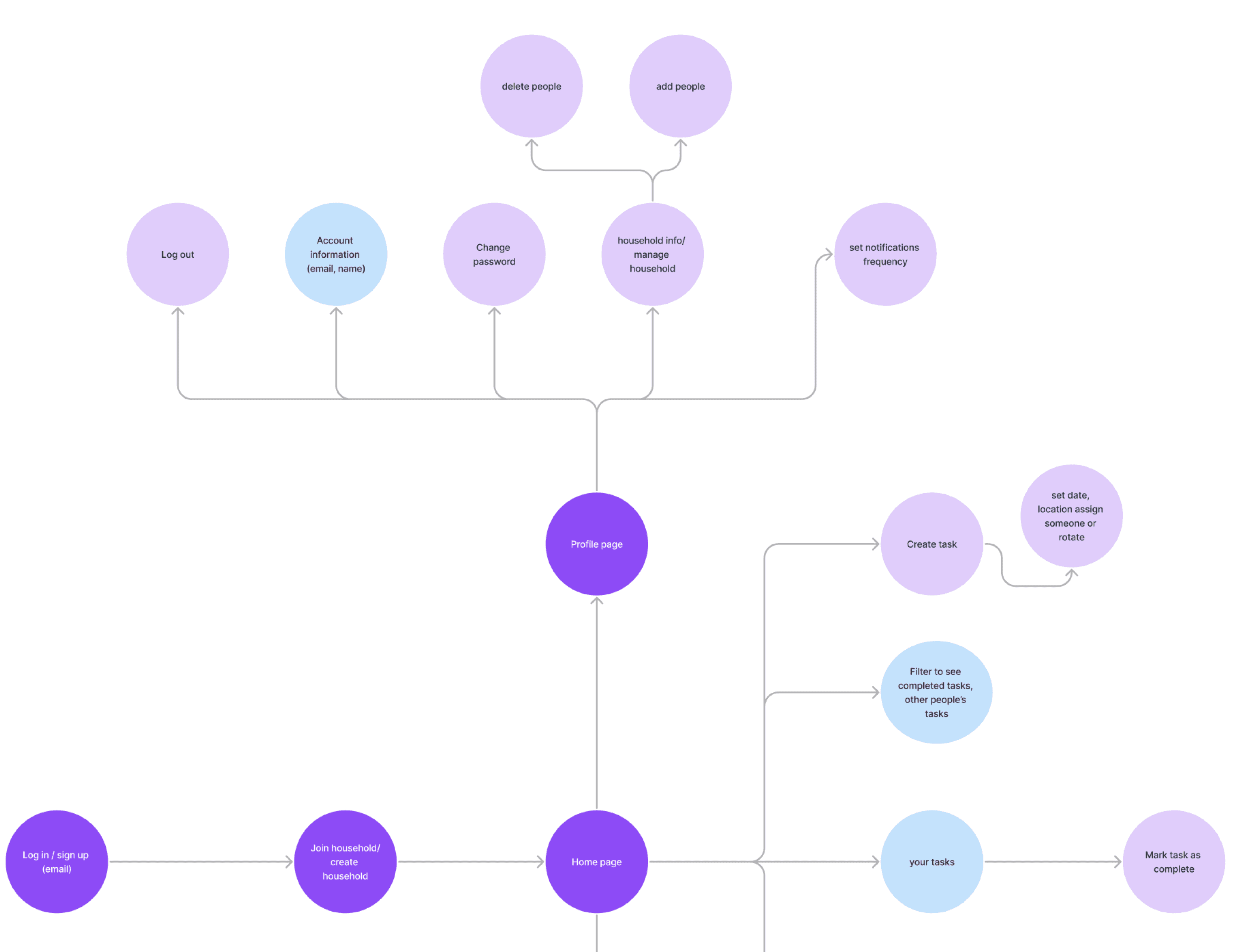
As a part of the ideation process, we need to visualize the steps users take to optimize navigation within our app using key takeaways from our primary and secondary research.
ONBOARDING
When users first enter the app, they have the option to create OR join a household.
HOME PAGE
From here, users can view + manage their tasks. Users can view + nudge others.
ROOMS PAGE
From here, users can view + manage their rooms + tasks within the rooms.
PROFILE PAGE
From here, users can access + edit their personal + household information.
WIREFRAMES
Low-Fidelity Designs.
We began by creating low-fidelity wireframes to outline our app's primary features, focusing on content and functionality without color.
Rooms
Kitchen
+ room
Bedroom 1
Bedroom 2
Bathroom


welcome to ChoreCharm
Login
Sign Up
developed by TSE
Onboarding
+ task
My Tasks
All tasks
Dishes
Overdue
Dishes
Overdue
Dishes
Today
Dishes
Today
Dishes
Tomorrow
Dishes
Tomorrow
Dishes
Thursday
Dishes
Thursday
+ task
Home Page
Rooms
Kitchen
+ room
Bedroom 1
Bedroom 2
Bathroom


Rooms Page
Hello, Vivian!
Manage Household
Notifications
Settings
Password
‘Household’ Members:
+2
‘Household Name’
Profile Page
EXPLORATION
Refining Our Designs.
During our exploration stage, we experimented with color and design, refined our wireframes through trial and error, and emphasized creating an intuitive user experience. We made changes to our designs based on feedback and critique from each other. This exploration process lasted 7 weeks and we iterated from Lo-Fis to Mid-Fis to Hi-Fis.
DESIGN SYSTEMS
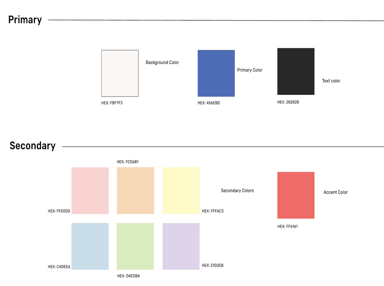
Style Guide
We came up with
Our color palette to set the tone, mood, and personality of our design.
Our typography to ensure readability and establishing visual hierarchy.

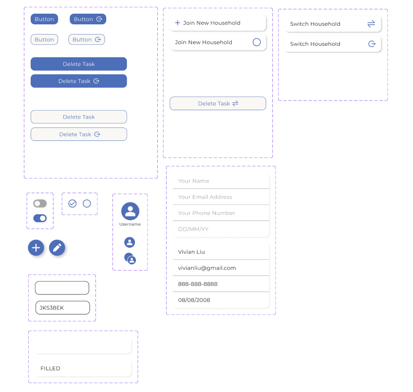
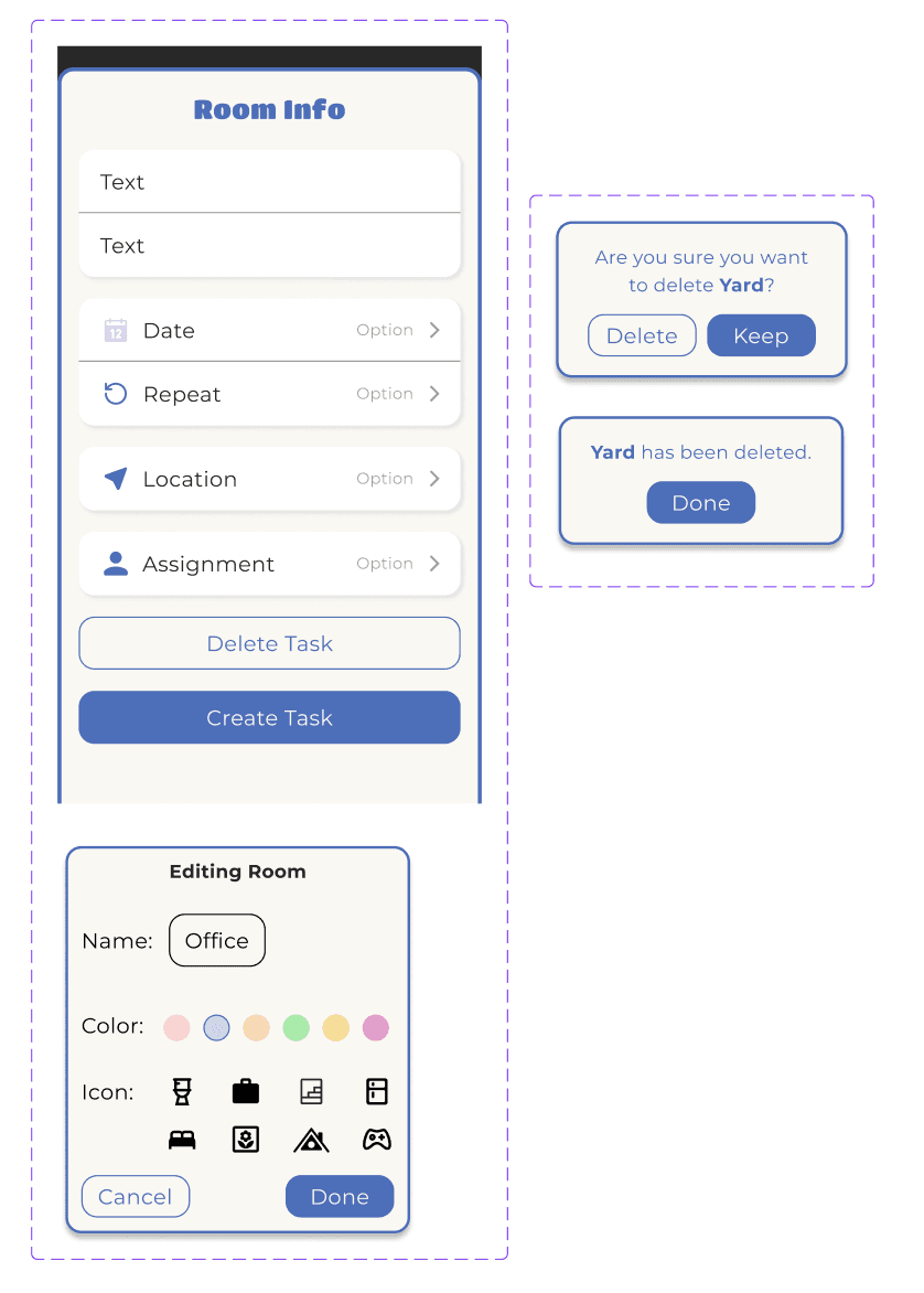
Components

MENUS
POP UPS
BUTTONS

ICONS
We used components as a way to standardize different design elements in order to ensure consistency and streamlining the design process.
TEXT BOXES
Empathize
Define
Ideate
Prototype
Test
VERSION 1
High-Fidelity Designs.
Through various iterations, we created high-fidelity prototypes of our app's pages, resulting in Version 1 of Chorespace.
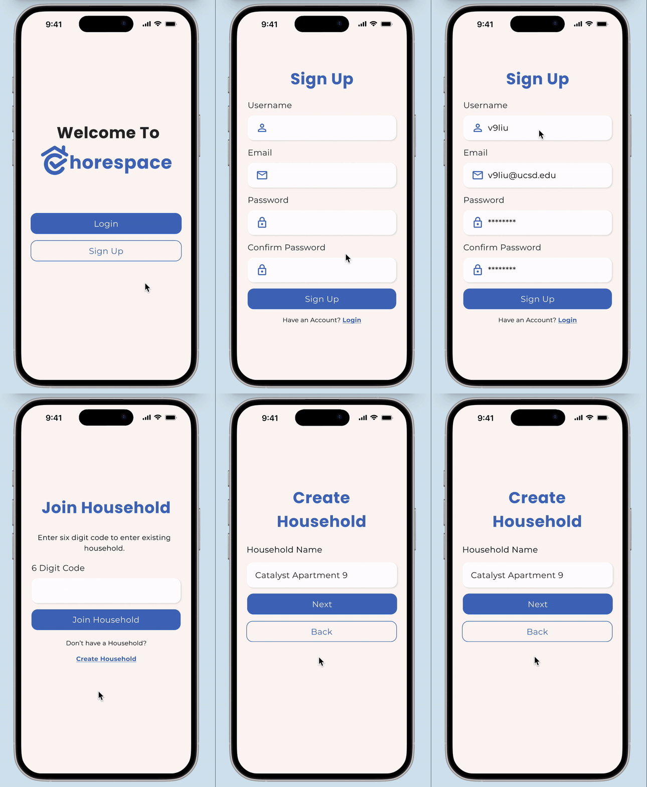

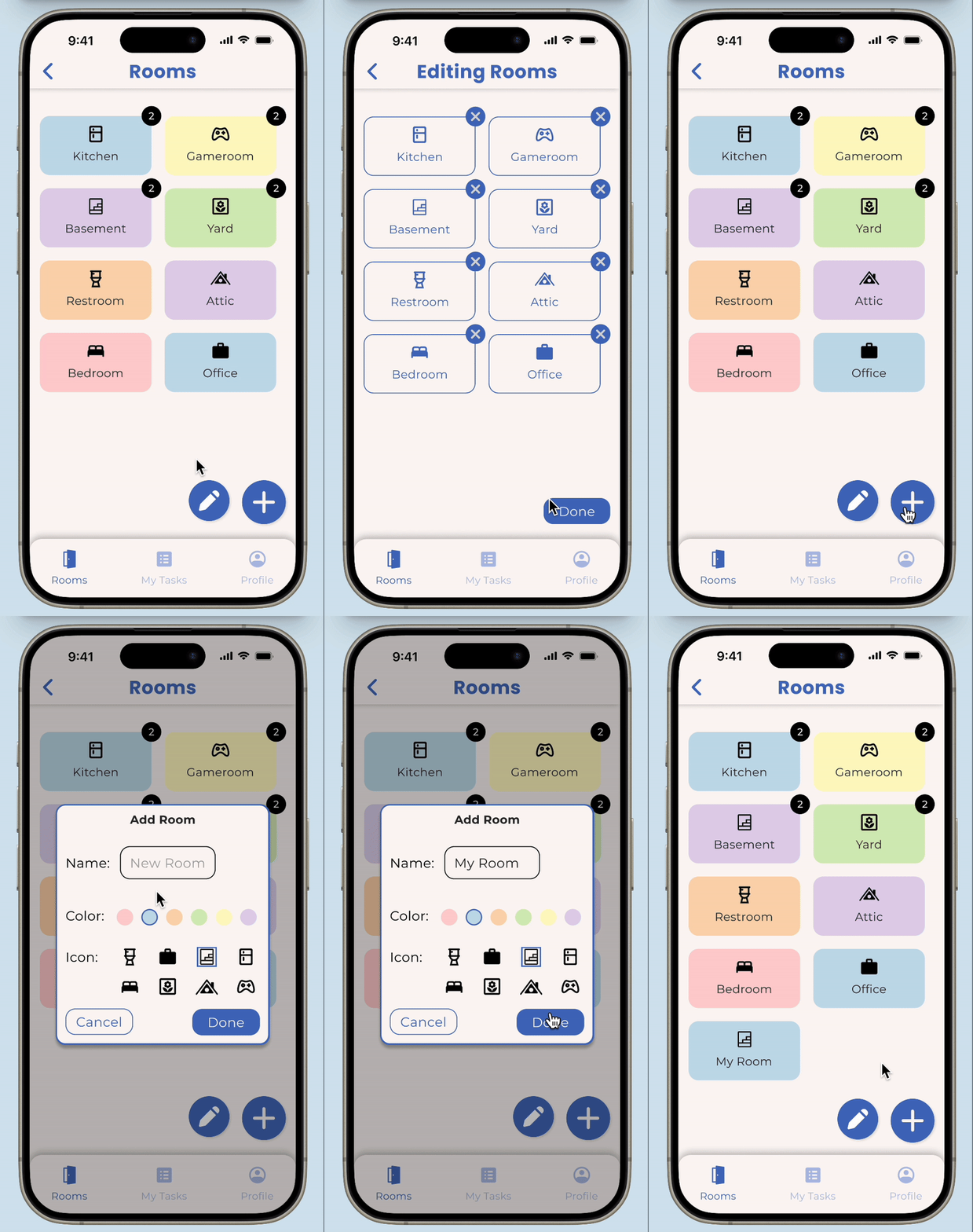

Onboarding
User can login or sign up. User can can make a household or join a household.
Home Page
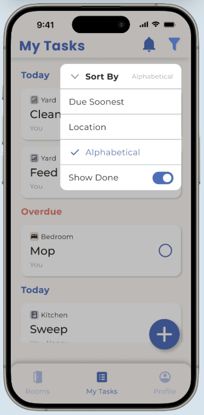
User can filter their tasks based on due date, location, or alphabetical order.
Rooms Page
User can edit, add, delete rooms within the household. User can edit, add, delete tasks within rooms.
Profile Page
User can edit personal information, set notifications, change password, manage household(s).
Empathize
Define
Ideate
Prototype
Test
USER TESTING
How Can We Improve for Version 2?
After completing our initial prototype, we need to gather feedback from Version 1 through user testing to identify necessary changes for Version 2. We conducted 12 user interviews, assigning 3+ tasks per page to assess the intuitiveness of our designs. The results highlighted areas for improvement and certain difficulties observed guided us in developing features for effective resolution.
User Testing Insights
ONBOARDING
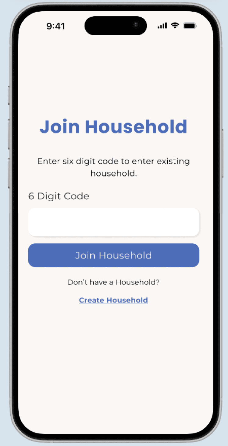
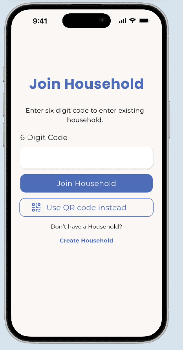
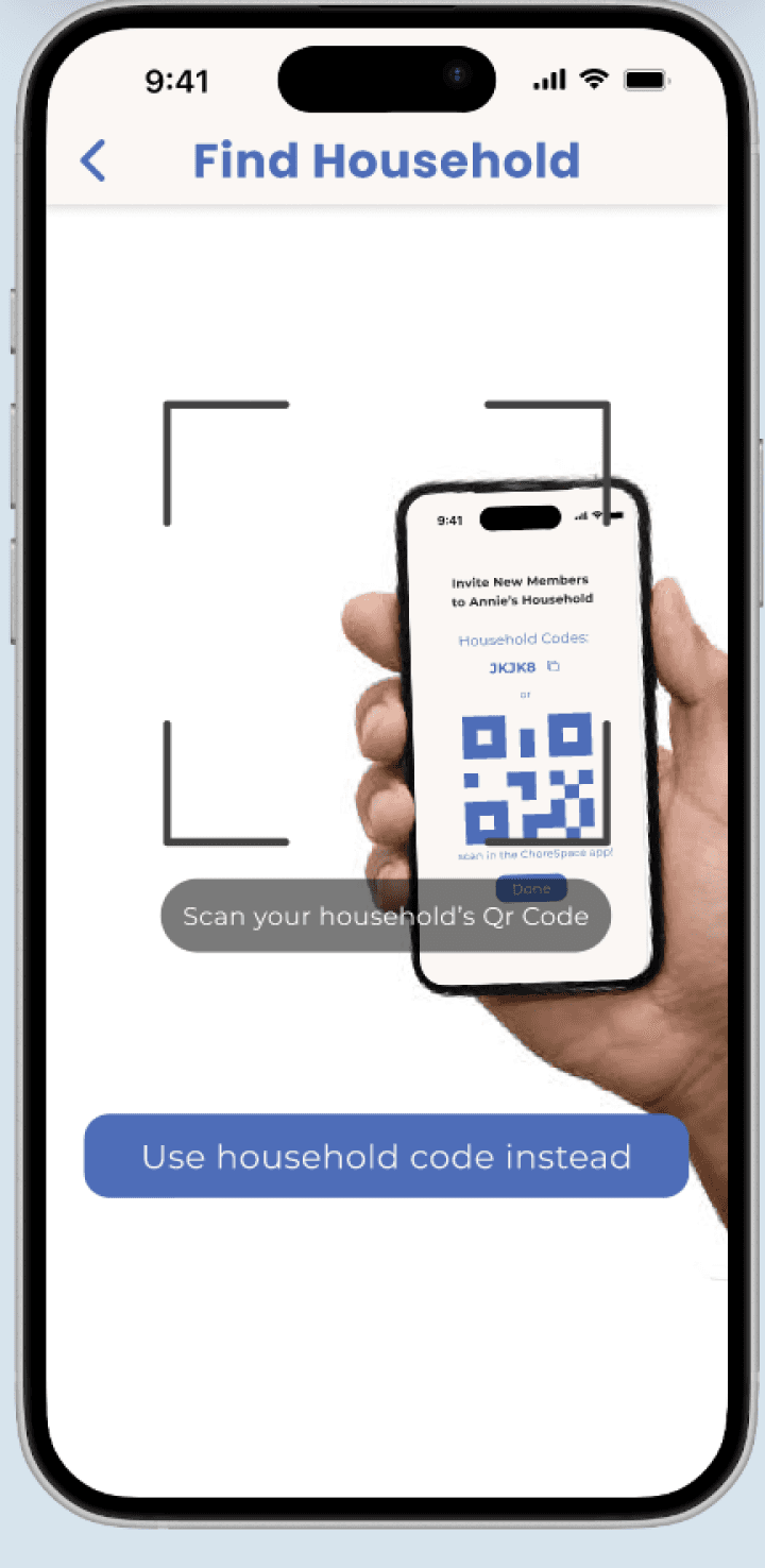
Issue 1: Users express confusion over “household code” entry.
V2 Feature 1: Integrate a QR code scanner for simpler joining.
Issue 2: Lacks originality + fails to establish an unique identity.
V2 Feature 2: Create a custom vector image for app.
HOME PAGE
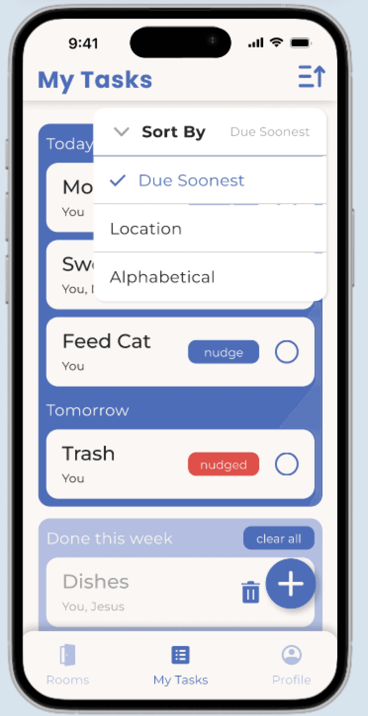
Issue 1: Users express confusion from location vs. task sorting.
V2 Feature 1: Add location tags to tasks cards for clarity.
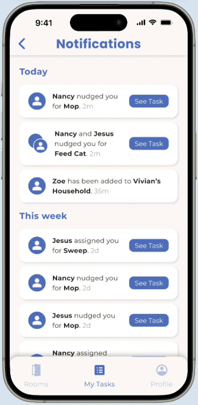
Issue 2: Missed popup notifications may affect user engagement.
V2 Feature 2: Introduce an in app view notifications feature.
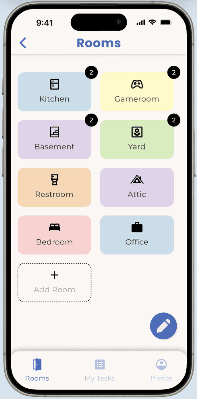
ROOMS PAGE
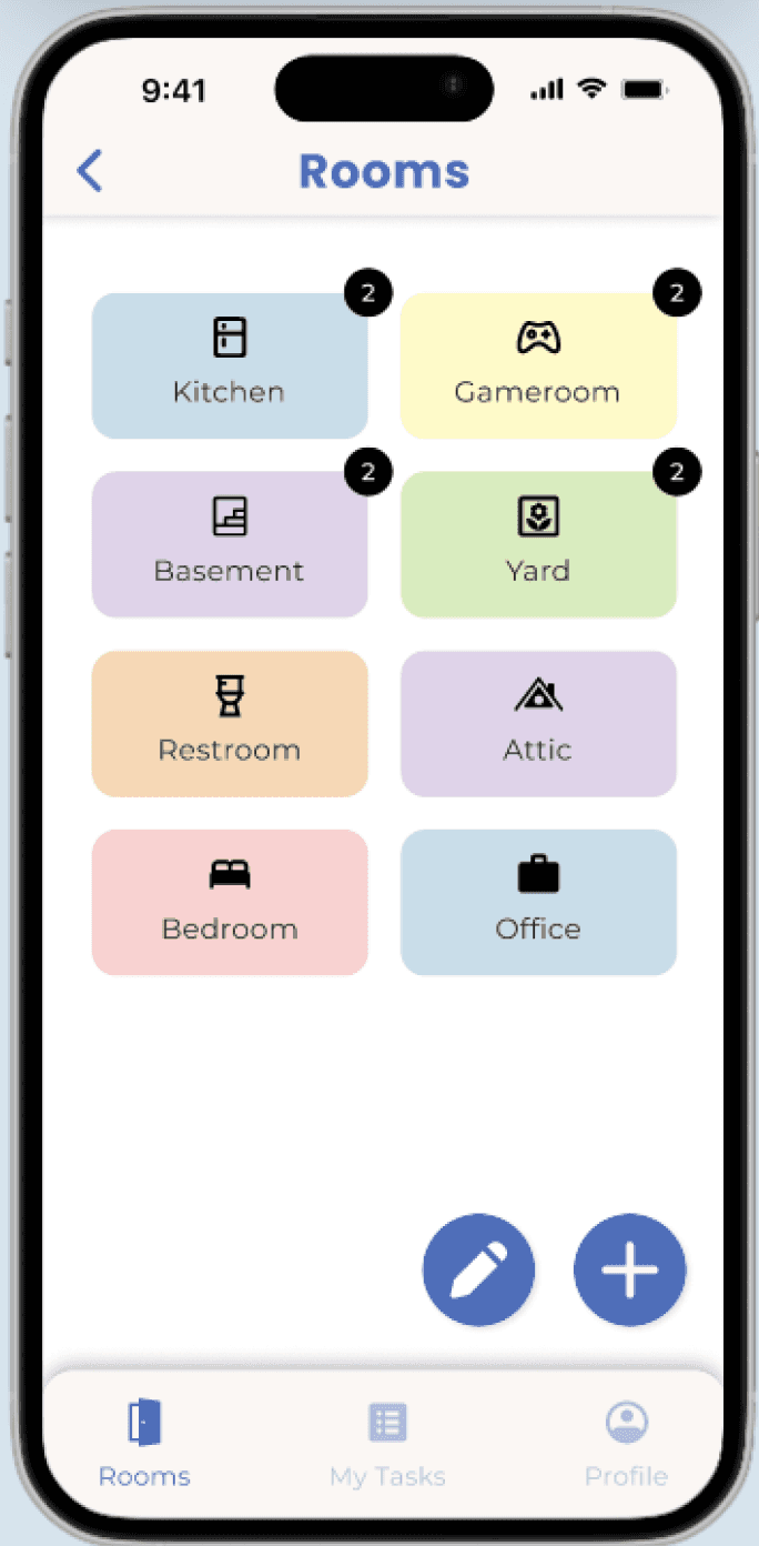
Issue 1: Users have difficulty in reordering rooms.
V2 Feature 1: Add a drag-and-drop feature for room reordering.
Issue 2: Add room button is unclear and too similar to edit button.
V2 Feature 2: Redesign add room button to be larger + prominent.
Relay to developers!
PROFILE PAGE
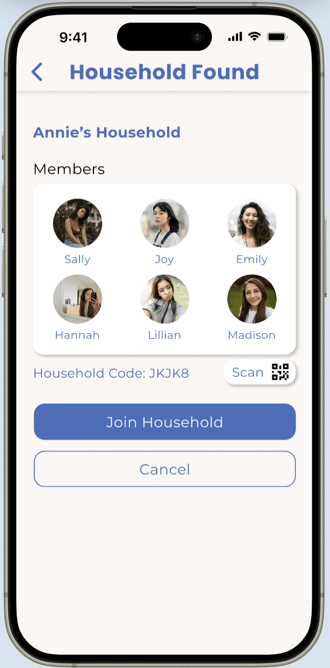
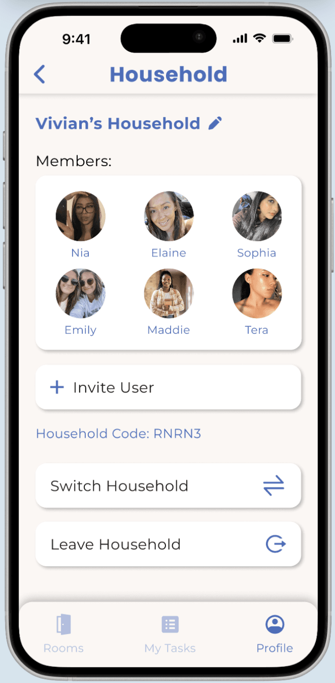
Issue 1: Users express uncertainty over joining the correct household.
V2 Feature 1: Display household confirmation screen before joining.
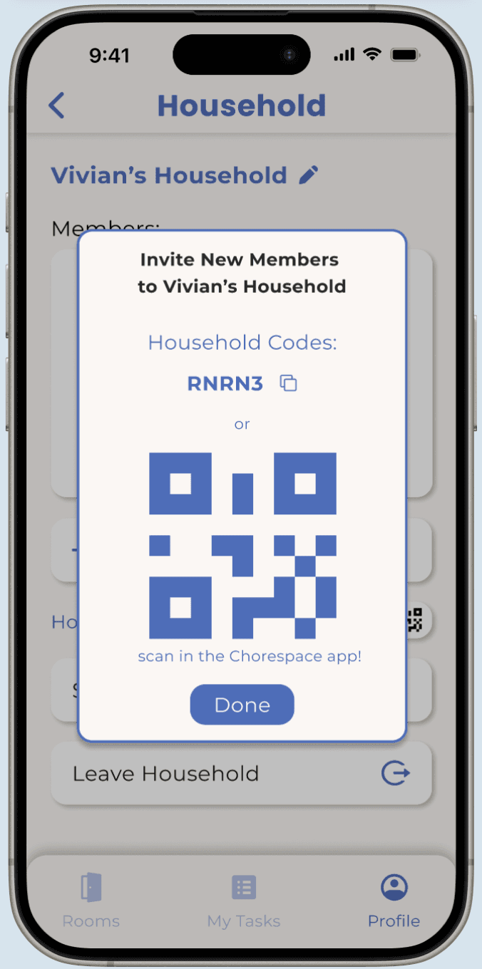
Issue 2: Users express confusion over “household code” entry.
V2 Feature 2: Implement a view QR code feature.
FURTHER TESTING
A/B Testing
While designing the household section of the profile page, I had a hard time choosing between two user flows for joining a household: immediate or manual. User testing was essential, so I asked users which option they preferred.
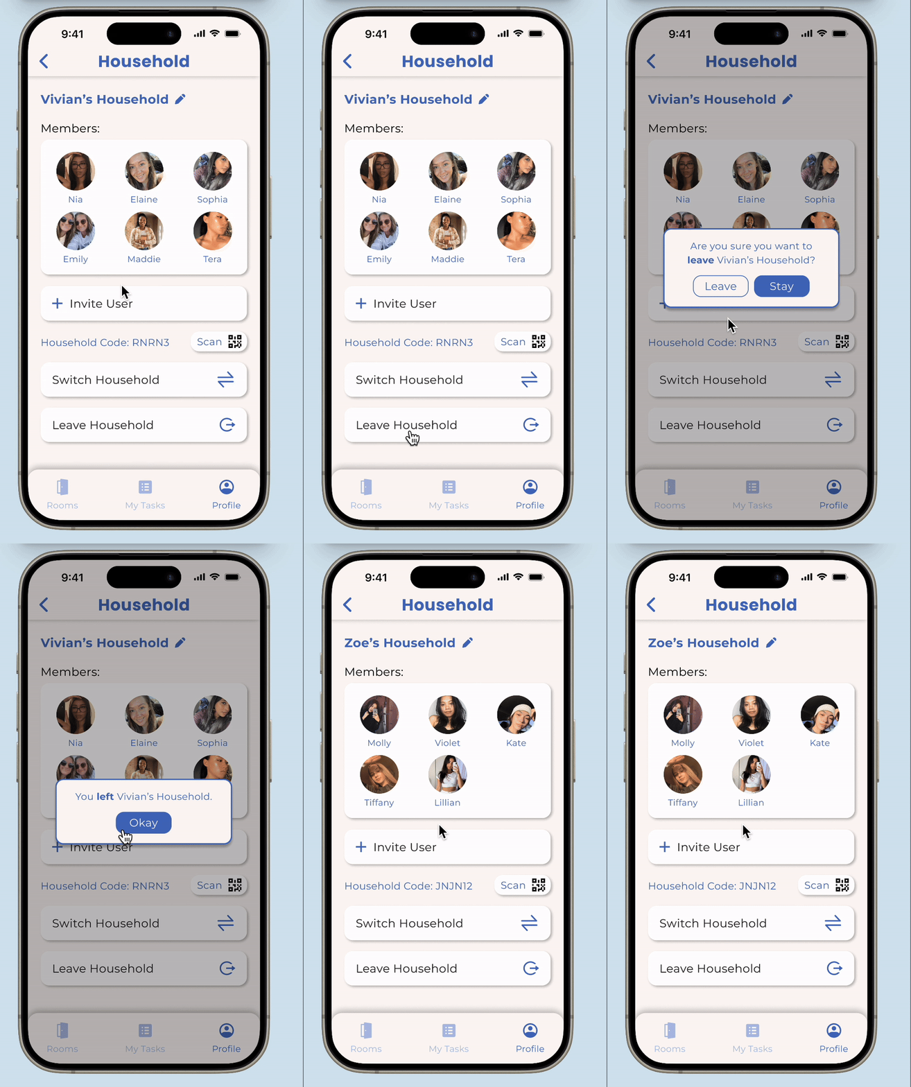
OPTION A
Automatically join Zoe's household

OPTION B
Manually join Zoe's household
TESTING INSIGHTS
Majority of Users Preferred Option A.
80% likes A
Minimized Clicks + Reduced Steps
20% likes B
Choice not worth inconvenience.
Initially, I thought Option B was better because it allowed users to choose a household after leaving their current one, rather than forcing a decision. When I presented this dilemma to my team, we decided to ask our target users for feedback which proved to be crucial. Surprisingly, 4 out of 5 users preferred Option A because it minimized clicks, reduced steps, and allowed them to switch households after joining, rather than selecting one upfront.
VERSION 2
Additional Features.
With insights from user testing, we introduced new features for Version 2.
Onboarding: Scan QR code & Finalized Chorespace branding.
Home Page: Location tags on task card & Notifications feature.
Rooms Page: Redesign add room button & Drag-and-drop feature.
Profile Page: Household confirmation screen & View QR code.
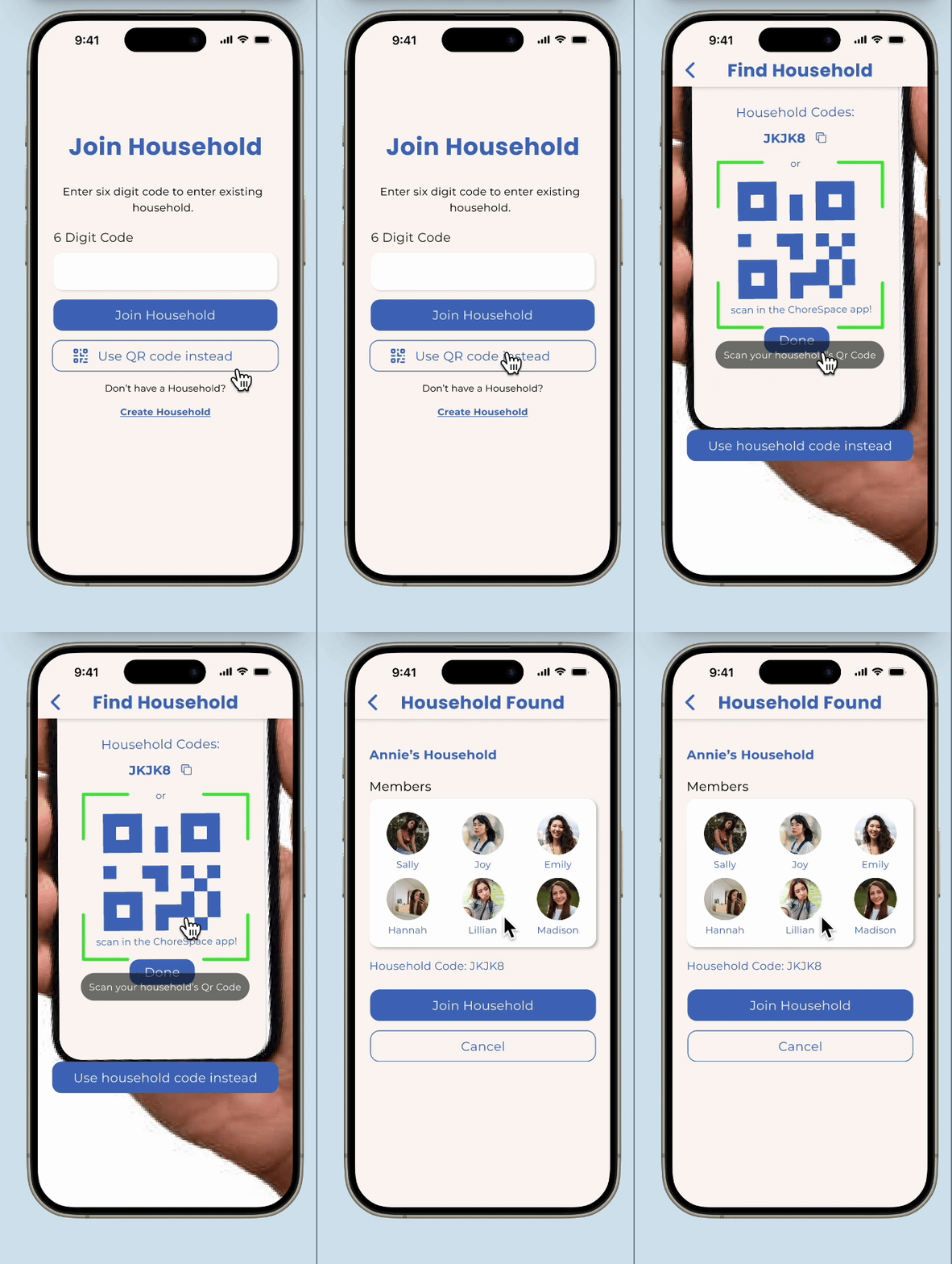
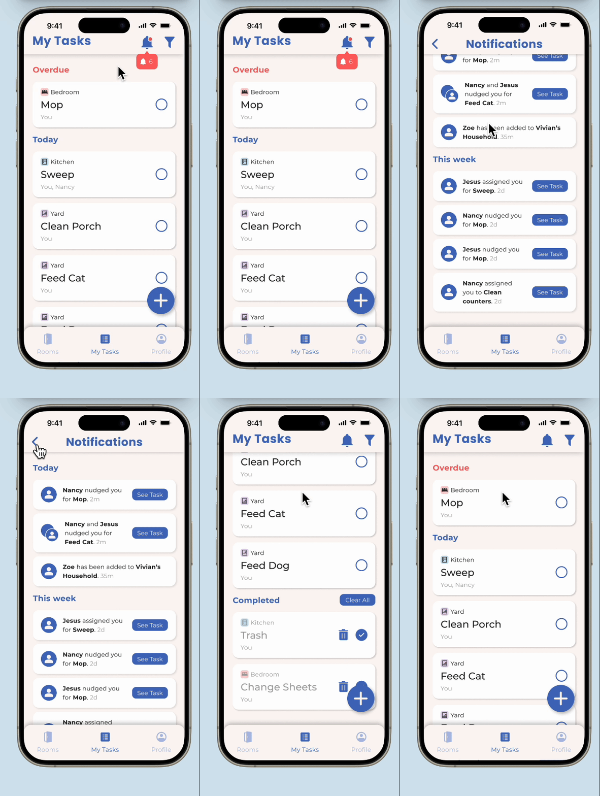


Onboarding
Home Page
Rooms Page
Profile Page
View Final Designs
FINAL REFLECTION
Next Steps.
I did this project as a part of Triton Software Engineering’s TEST program, where my team and I narrowed down a prevalent problem in our community and designed a solution to combat that issue. Now, our team has handed off our designs to TEST developers, who are working to bring Version 2 to life! Once it’s launched, we aim to gather user feedback and dive into more user testing to guide our designs for Versions 3 and beyond.
What I Would Do Differently.
We could’ve done more extensive ideation to gain a deeper understanding of our users, potentially expanding our design focus to include secondary users as well. This includes creating user personas and information architectures.
What I Learned.
Justifying My Designs: I learned to justify my design choices, ensuring that my ideas were understood and aligned with project goals. I also realized the value of constructive feedback, which allowed me to improve my designs to better fit user needs.
The Importance of User Testing: Through conducting user testing in this project, I learned to critically evaluate my design choices- understanding that what might seem intuitive to me could be perceived differently by users. This process of adapting my designs based on real user feedback emphasized the importance of designing with empathy. It reminded me that my ultimate goal is to create a user experience that resonates with our target audience, not just one that aligns with my personal design preferences.
Thanks for stopping by!
Let’s connect & create a positive impact together :)
© 2024 Vivian Liu