
Overview
CONTEXT
Designing for Local Nonprofit.
My team and I worked with HandsOn San Diego, a local 501(c)(3) nonprofit, whose mission is to strengthen communities through volunteer action. They serve as a database, connecting volunteers with opportunities to foster an active volunteer network in San Diego. Specifically, we worked directly with our client: Jessie Case (HandsOn Program Director) to enhance their community engagement through re-designing their San Diego Gives campaign page and launching their sponsorship page.
HOSD’S CURRENT IMPACT
Thousands Impacted. High Stakes.
5,313
Projects Completed
8,590
Active Volunteers
26,052
Hours Served
THE PROBLEM
Raising Money. Recouping Losses. Streamlining Social Media.
From our initial client meeting, we found that HOSD faced difficulties driving engagement for their San Diego Gives campaign to raise $30,000 by September 5th and recouping the costs they've lost from compensated membership fees.
OUR SOLUTION
Two Deliverables.
We decided to address the problem with a 2-fold solution.
Re-designing SD Gives campaign page to make it more engaging and boost donations.
Implementing Sponsorship Page to drive corporate sponsors and offset costs from compensated membership fees.
SOLUTION IMPACT
Making a Difference.
SD Gives Campaign Page
Raised $24,458
Sponsorship Page
100% Increase Sponsors
“I believe our fundraising page now stands out compared to the other organizations participating in the regional giving day because it goes far beyond a donation form”
- Jessie Case (HandsOn San Diego Program Director)
MY CONTRIBUTION
Designing for Campaign & Sponsorship Page.
As one of two designers on the team, I was in charge of creating wireframes, high-fidelity designs, and prototypes for the SD Gives Campaign page and Sponsorship Page. I also helped with the final implementations of these deliverables through Click & Pledge and CMS.
Solution Preview
Deliverable 1:
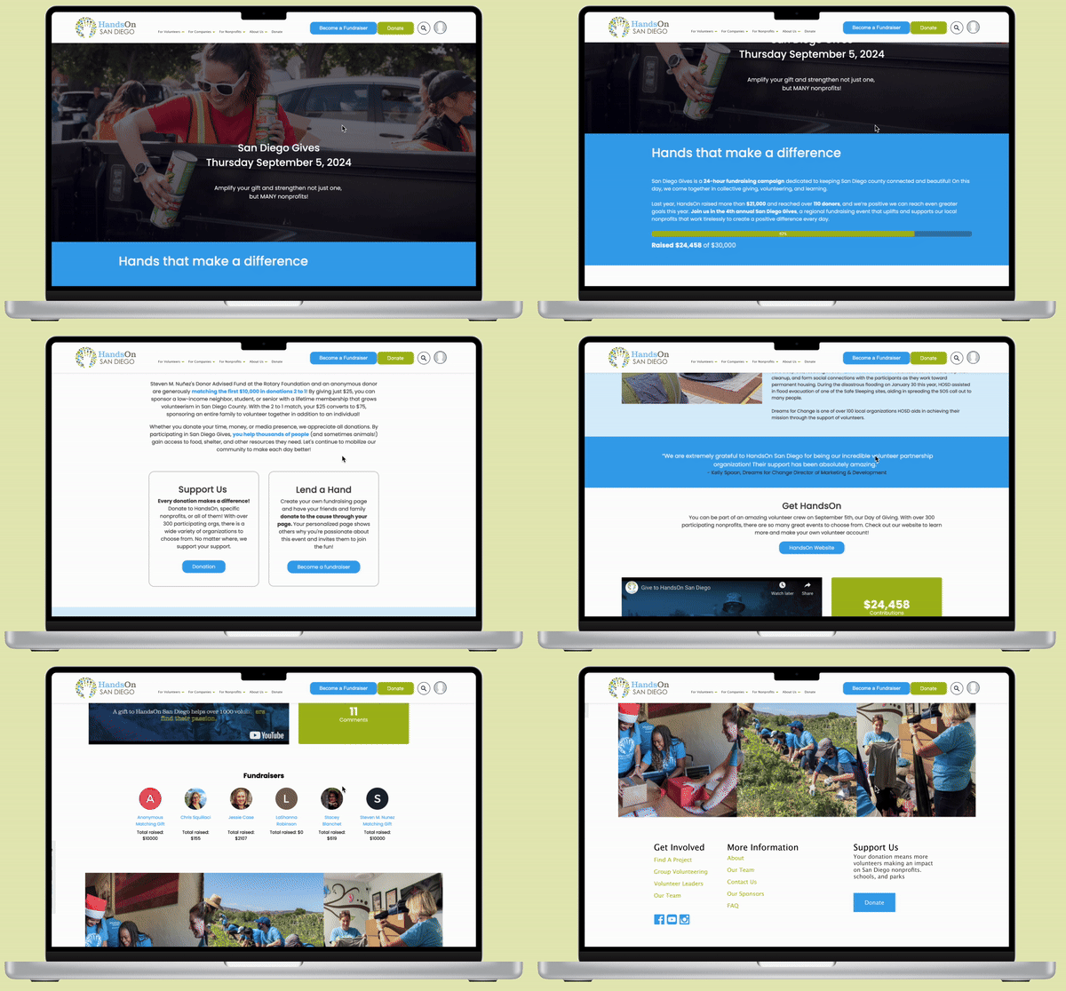
San Diego Gives Page
Fundraising Stats: Kept smaller stats at the bottom to show impact.
Blue Theme: Maintained the all-blue design per client preference.
White Titles: Retained white titles on a blue background for clarity.
Cards: Used "Volunteer" and "Donate" cards to organize information effectively.
Donation Bar: Kept the bar with donor numbers and additional stats at the bottom.
Deliverable 2:
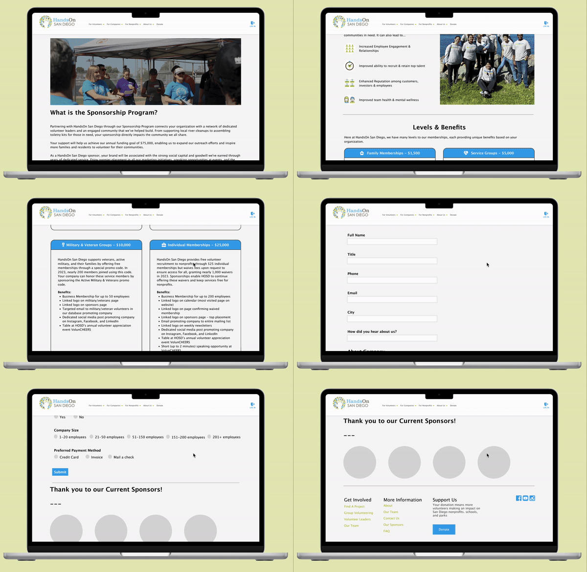
Sponsorship Page
Header Section: Intro blurb with a large header image at the top.
Why Partner with HandsOn: Key benefits for businesses with visual icons for engagement.
Levels & Benefits: Clear donation tiers in organized card layouts, with icons and colors for better visuals.
Embedded Sponsorship Form: Directly on the page to reduce clicks.
INITIAL RESEARCH
Understanding Volunteer & Donor Demographics.
Before we started any designing, we first aimed to understand HOSD’s volunteer and donor demographics because having a clear picture of who engages with the organization is essential for creating a seamless user experience. Our client provided us with spreadsheets of past volunteer and donor demographic data, so we analyzed and identified key characteristics such as age, location, motivations, and engagement patterns in order to understand our audience.
WHAT WE ANALYZED
1
Volunteer Demographics
Purpose: To identify primary audiences & how people come across HOSD.
2
Donor Demographics
Purpose: To identify HOSD top donors & peak donation periods.
KEY INSIGHTS
What We Discovered.
1
Insight: Most donors aged 50-70 & white/caucasian & have graduate degrees.
Feature: Larger fonts for readability & prominently placed donate buttons for easy access.
2
Insight: 68.42% of donors are also volunteers.
Feature: Highlight volunteer testimonials & photos to personalize experience.
3
Insight: Volunteers serve ~90 hours ---> Strong engagement with HOSD mission.
Feature: Include real-time impact metrics to showcase statistics & foster connections.
Through this research, we were able to understand how audiences engage with HOSD and their donation patterns. We used these insights to influence our design choices later on, ensuring they connect with the HOSD audience, meet their needs, and include features to attract, support, and retain both volunteers and donors.
Deliverable 1: SD Gives Campaign Page
CONTEXT
About SD Gives.
San Diego Gives is a 24-hour fundraising campaign on September 5th, bringing the San Diego community together for collective giving, volunteering, and learning. This marks HOSD’s 4th annual participation in the event as a non-profit aiming to reach their $30,000 donation goal before the deadline.
THE PROBLEM
Cluttered. Confusing. Outdated.
My co-designer and I set out to redesign the outdated San Diego Gives Campaign page, which had been cluttered, confusing, and poorly organized since its last update in 2022. With only three weeks before the page's launch, we worked under tight time constraints to create a more engaging and user-friendly design.
COMPETITIVE ANALYSIS
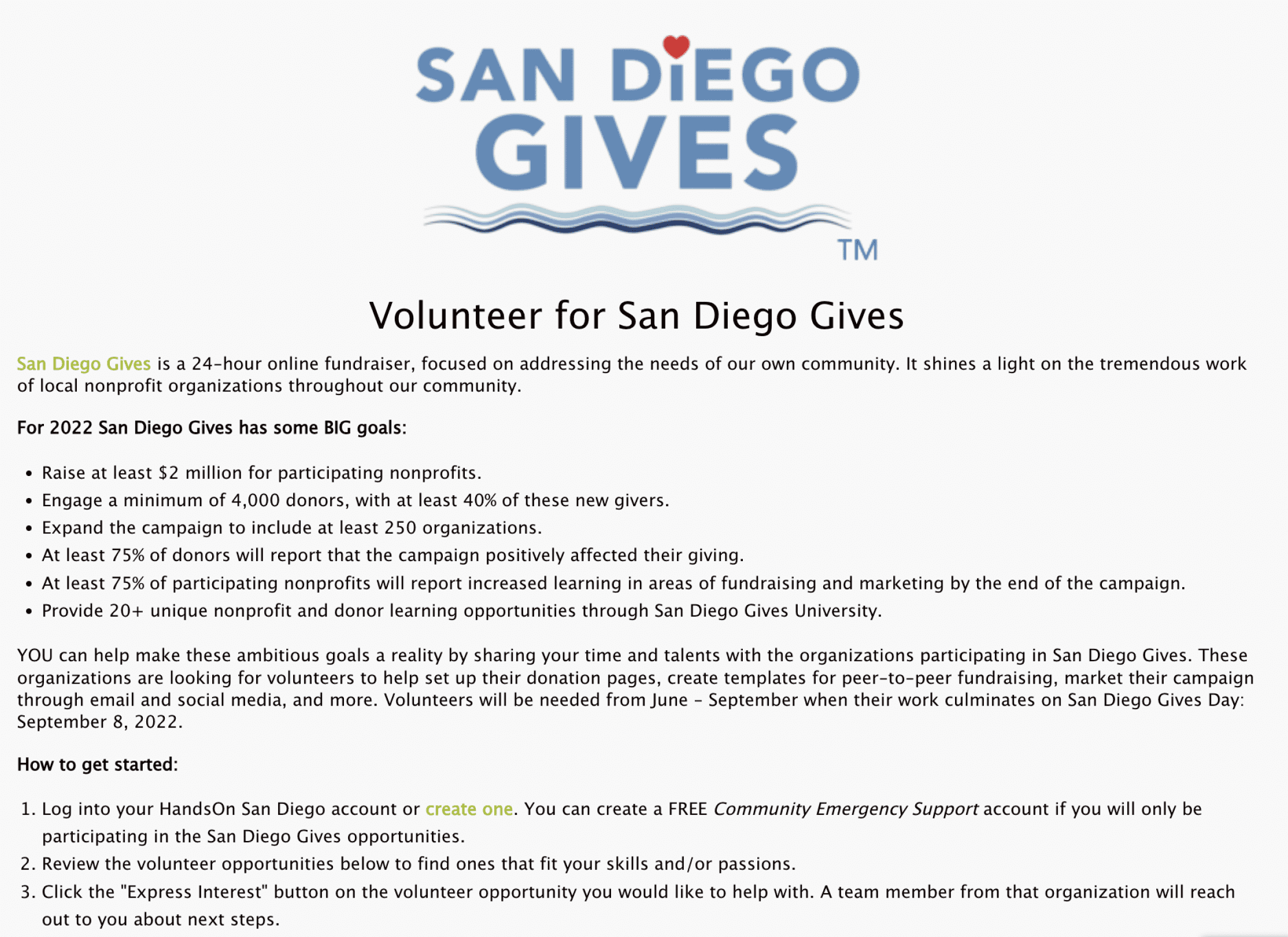
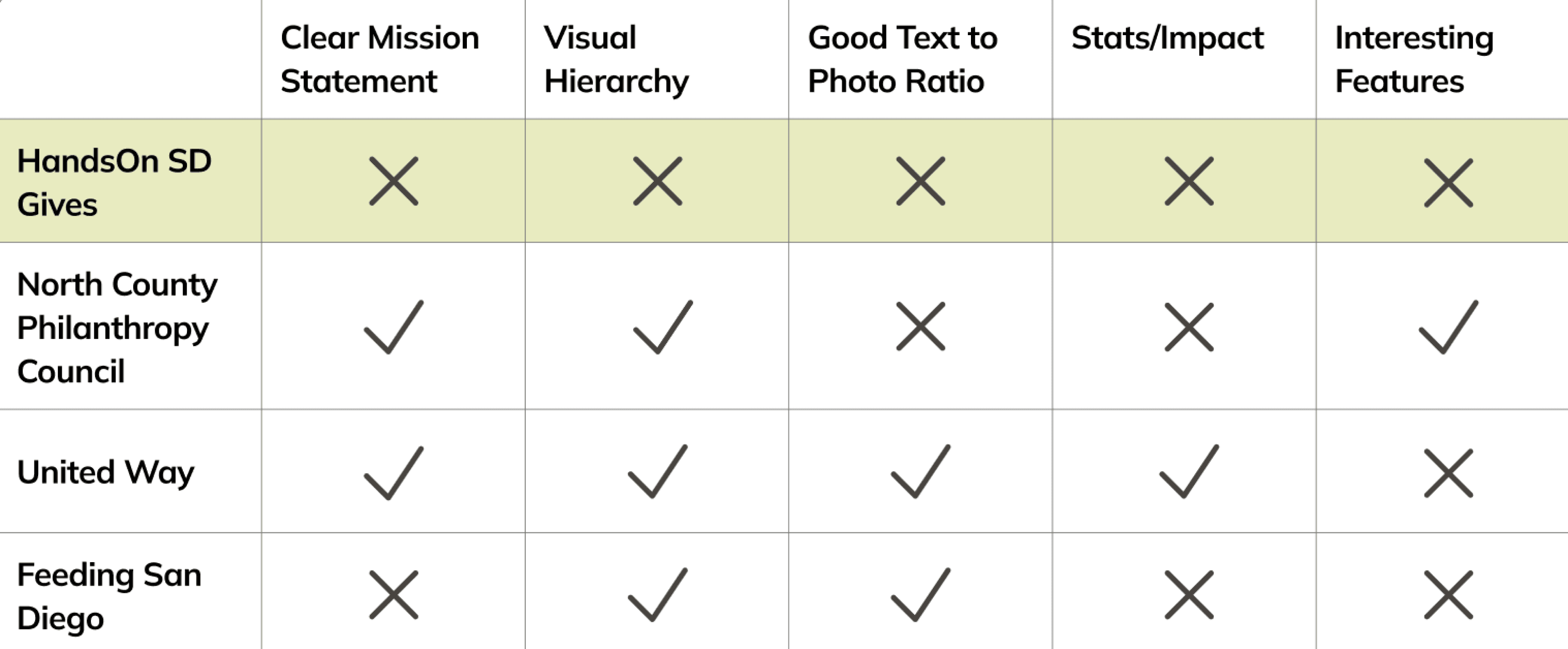
To inform our designs, we looked at other non-profit campaign pages. We analyzed:
Three San Diego Gives Pages: North County Philanthropy Council, SD Gives Official Page, United Way
Three External Fundraising Pages: Food from the Bar, Lucky Duck Foundation, Red Cross ADGP
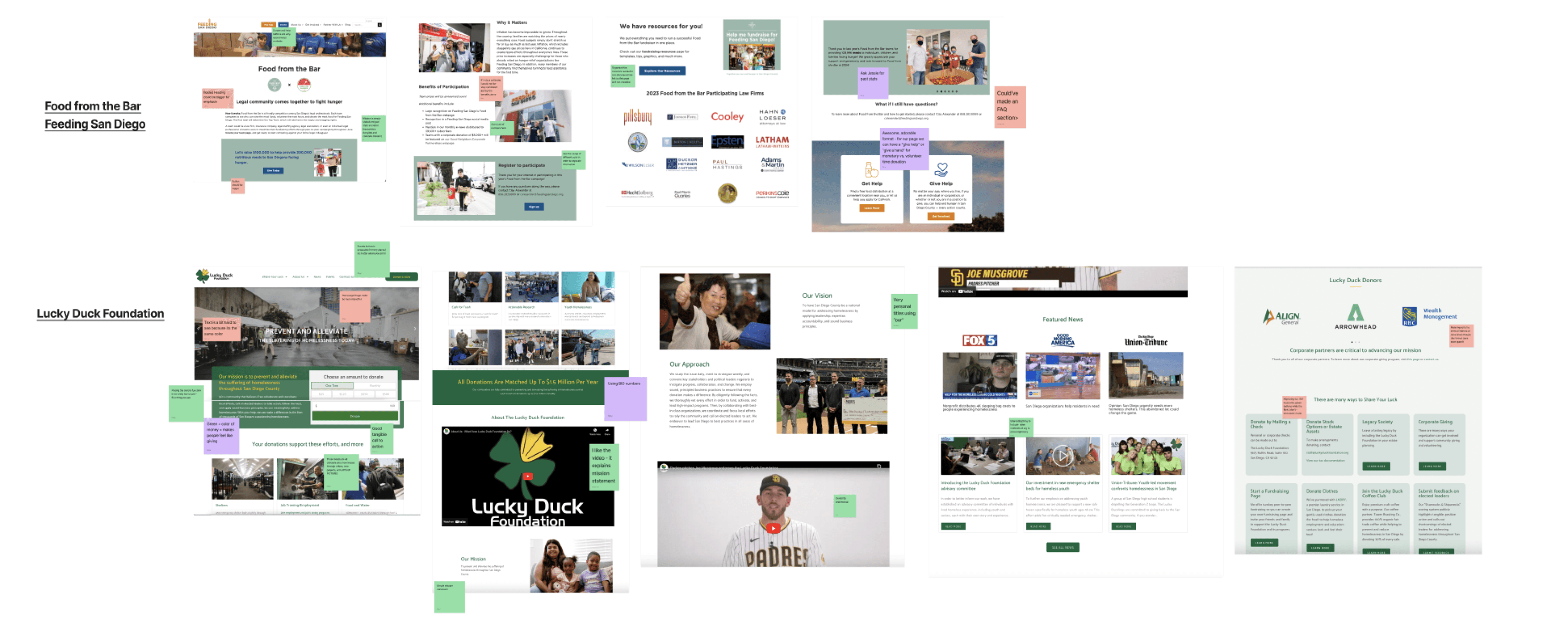
We utilized green to indicate like, red to indicate dislike, and purple to indicate potential.
COMPETITIVE AUDIT
Lacking In Every Aspect.
FINALIZE FEATURES
Consolidate Findings.
From the competitive analysis and further discussions with our team and the client, my team and I finalized the key features for our SD Gives page to showcase an effective campaign page.
Big Introduction Photo: Grabs attention and creates an emotional connection.
Statistics Displayed at Top: Shows impact and builds trust instantly.
Clear ‘About’ Section: Explains the campaign’s purpose and mission instantly.
Clear Donate Buttons: Makes giving easy and accessible.
Lots of Photos: Personalizes cause with visual storytelling.
Volunteer Testimonials: Builds credibility with real stories of impact.
WIREFRAMES
Low-Fidelity Designs.
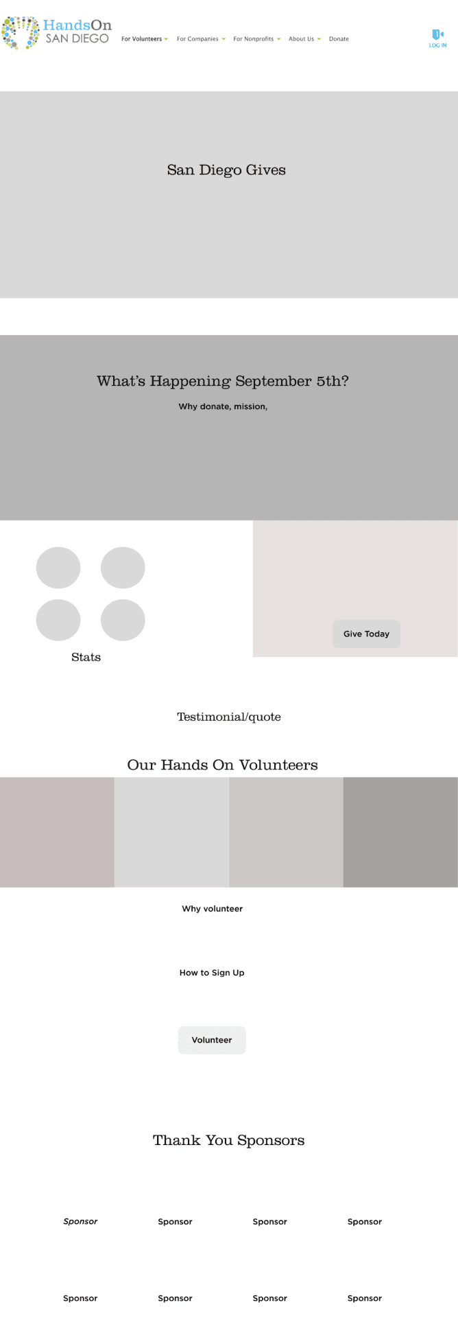
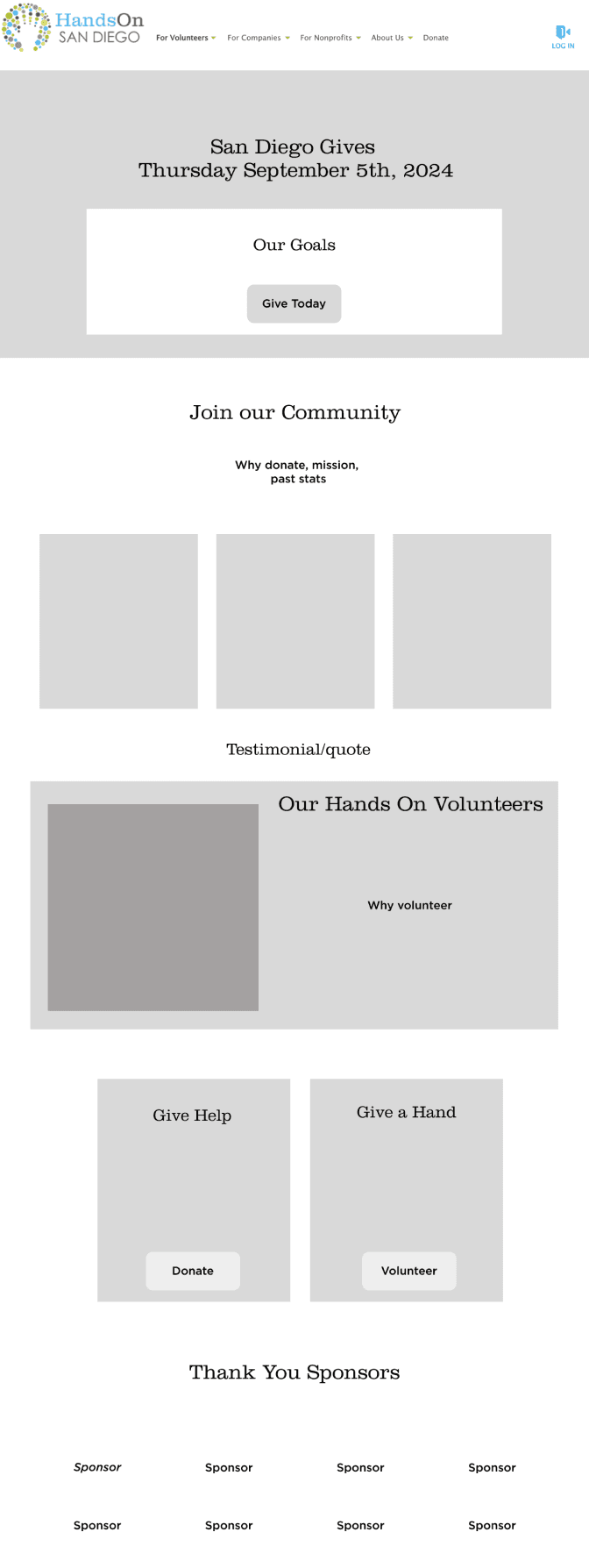
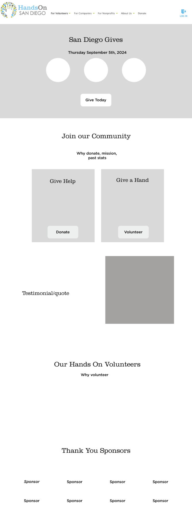
Guided by our research, we created four low-fidelity wireframes to test features and layouts, each designing two to offer diverse options for the client to review.

BRAND GUIDELINES
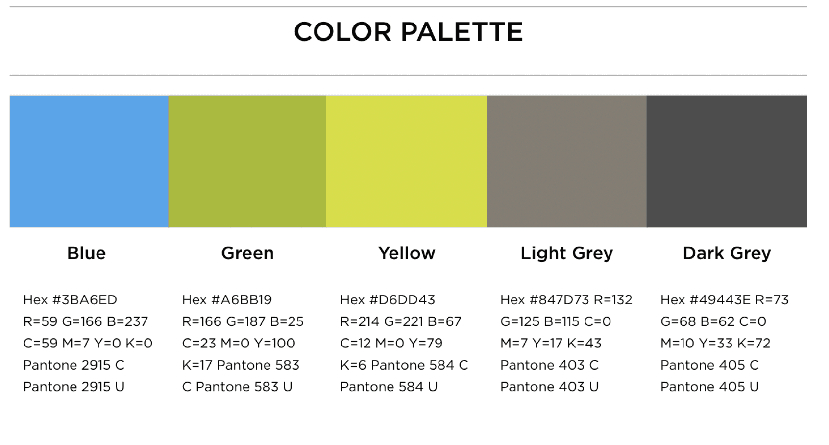
Color Palette & Typography.
As we iterated from our Low-Fidelity designs to Mid-Fidelity, we made sure to take into consideration:
HOSD color palette to maintain a cohesive visual identity.
HOSD typography to enhance readability and brand recognition.

CONSTRAINTS
Time & Development Constraints.
Unfortunately, although we had a lot of creative visions for enhancing the campaign page, we had to navigate several constraints, including:
Time Constraints: We needed to finalize the design within just three weeks of meeting the client in order to have it done before the San Diego Gives campaign launch deadline.
Development Constraints: We had to implement our design through the Click & Pledge platform, which had strict sizing restrictions, low customizability, and pre-made properties to select from. This restricted the scope of our creativity and narrowed down the possibilities for our final design ideas.
EXPLORATION
Refining Our Designs.
While navigating our constraints and taking HOSD brand guidelines into consideration, we explored more versions of the campaign page designs with different opacity levels of HOSD brand colors, further refining our wireframes through experimentation. We made changes to our designs based on feedback from team members, our project manager, and our client. This exploration process lasted 2 weeks and we iterated from Lo-Fis to Mid-Fis to Hi-Fis.
FINALIZED FOUR VERSIONS.
High-Fidelity Designs.
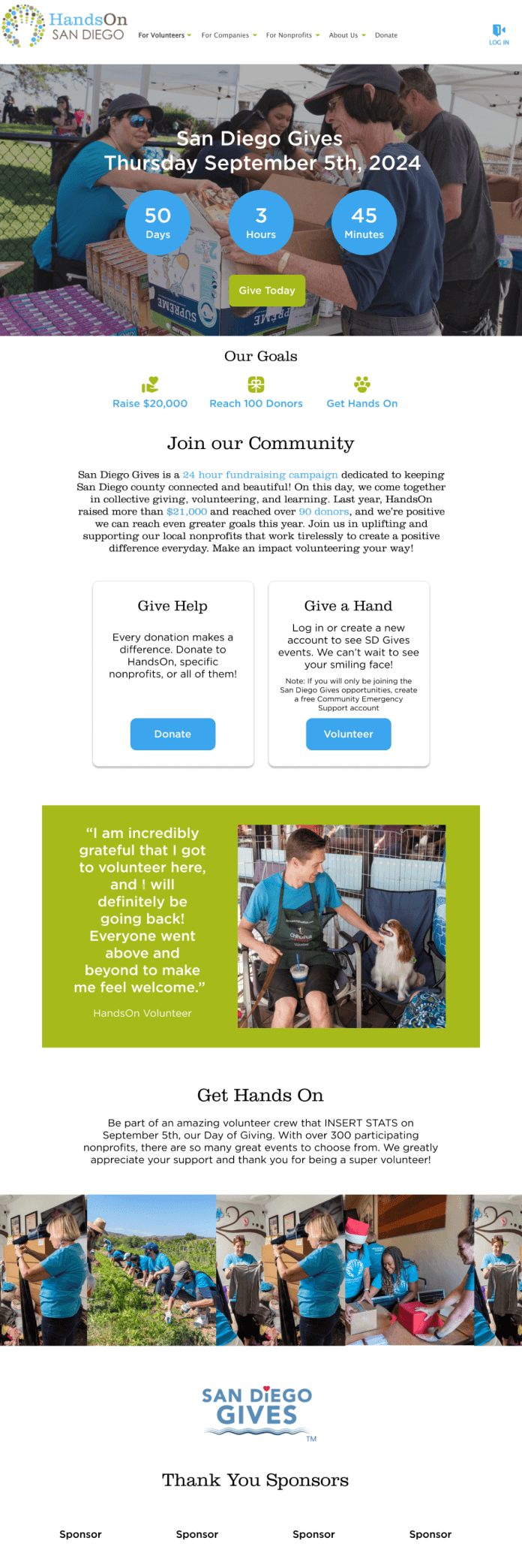


Clear goals shown right away
Photo carousel
Instructions on how to volunteer
Donate and volunteer cards
Countdown timer
Color blocking the about section
CLIENT FEEDBACK
Likes = KEPT. Dislikes = DISCARDED.
After presenting our final four designs to Jessie, she provided feedback on what she liked and disliked about each design, which we used to guide our final design choices.
FINAL DESIGN
Implemented on Click & Pledge.
After final feedbacks, our client gave us access to their website building platform: Click & Pledge, and we implemented our final design on there. The site went live on August 17th!
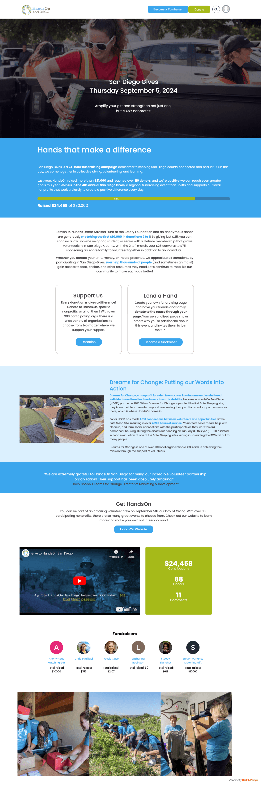
What We Kept:
Fundraising Statistics: Retained smaller fundraising statistics near the bottom of the page to show impact.
Blue Theme: Maintained the flow of the all-blue design due to client preference.
White Titles: Kept white titles on a blue background for clarity and consistency.
Video Integration: Incorporated video due to client requests.
Cards for Organization: Two cards displaying "Volunteer" and "Donate," to effectively display information.
Donation Bar: Retained the donation bar, including the feature showing the number of donors, with additional donor statistics placed at the bottom.
What We Changed:
Changed phrasing of cards: To be more inclusive & inviting.
From "Give a Hand" to "Lend a Hand."
From "Give Help" to "Support Us."
Accessibility Adjustments: Avoided colorful text on colorful backgrounds to ensure better readability.
Matching Donor Section: Updated and added a dedicated section highlighting the matching donor.

IMPLEMENTATION
Designs vs Feasibility.
Implementing our designs in Click & Pledge was challenging due to its confusing UI and strict limitations on colors, text sizing, and features. Working under a tight one-week deadline, my co-designer and I adapted our Figma designs, learning problem-solving under pressure. However, platform constraints ultimately prevented some features like the calendar countdown and photo carousel from being implemented in our final design.
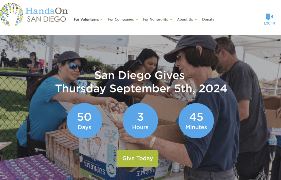
Calendar Countdown
No countdown widget
Can’t build new widget
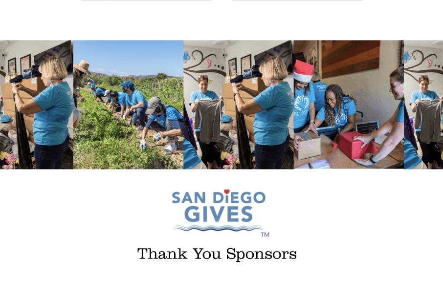
Photo Carousel
Can’t bypass margin constraints
Can’t crop or resize images
IMPACT METRICS
Successful Campaign.
$24,458 Raised
88 Donors
$3,000 increase from 2023
Deliverable 2: Sponsorship Page
CONTEXT
About HOSD Sponsorship Page.
The HOSD sponsorship page is a new initiative designed to connect organizations with HOSD’s network of volunteer leaders and opportunities to make an impact in local communities. Through different sponsorship types, organizations can access unique benefits based on their selected type.
THE PROBLEM
Loss from Compensated Membership Fees.
During our initial client meeting, we learned that HOSD was facing challenges in recovering money lost from compensated membership fees. Their sponsorship page was still a work in progress, with all the information organized in Google Slides. To address this, our team proposed expediting the process to transform the concept into a fully implemented, functional page.
INITIAL RESEARCH
Key Insights from Sponsorship Page Slides.
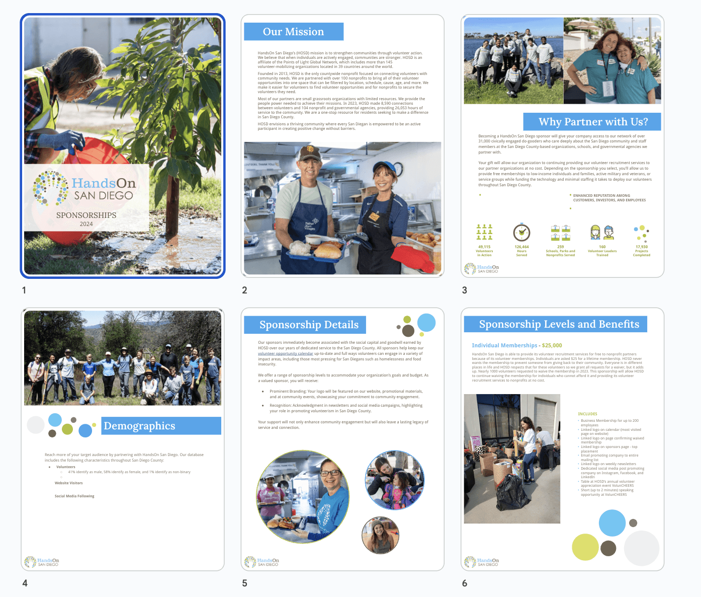
After reviewing HOSD’s slideshow on sponsorship page
information, we identified several key insights:
Current Status:
No sponsors have been secured yet.
The sponsorship page will be pivotal in launching all sponsorship efforts for the nonprofit, representing a high-impact initiative.
Target Audience:
Larger companies and organizations.
Sponsorship Levels:
Four distinct sponsorship levels:
Military & Veterans
Individual Businesses
Family Businesses
Service Groups
2023 Metrics:
Notable engagement metrics:
184 active military/veterans used the promo code.
995 individuals waived membership fees.
17 group memberships recorded.
19 families waived membership fees.


COMPETITIVE ANALYSIS
What Works Well? What Doesn’t?
To inform our designs, we looked at other non-profit campaign pages. We analyzed six sponsorship pages: HandsOn Bay Area, SD Humane Society, Feeding San Diego, Lucky Duck, Rays of Hope, and Scoop.

COMPETITIVE AUDIT
What Others Did Well.

FINALIZE FEATURES
Consolidate Findings.
From the competitive analysis and further discussions with my team and client, we finalized key features for HOSD’s sponsorship page. We wanted to include:
Clearly Categorized Sponsorship Benefits: Outlines what sponsors gain by participating, easy to find.
Call-to-Action Button: Encourages immediate action to become a sponsor.
Impact Statement: Highlights the organization's mission and potential outcomes of sponsorship.
Current Sponsors Section: Provides visibility for current sponsors to build credibility and attract other sponsors.
Many Visuals: Enhances engagement and emotional connection through showcasing of HOSD volunteers.
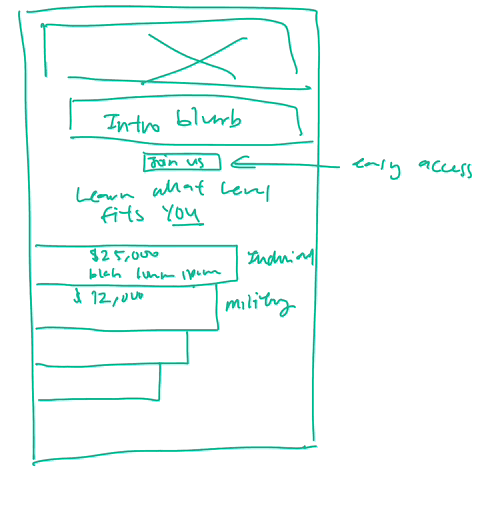
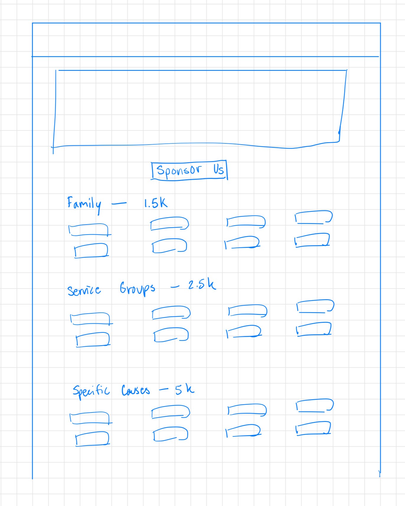
IDEATION
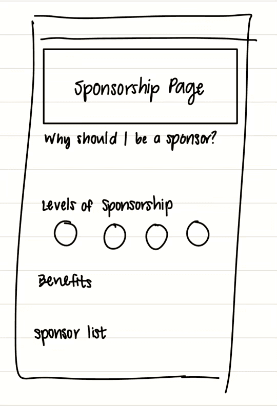
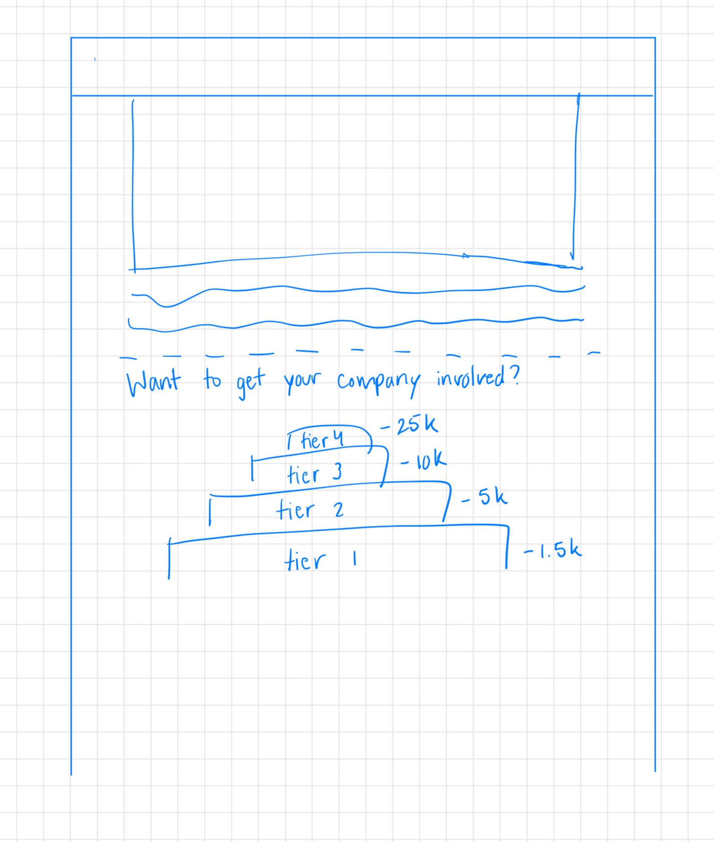
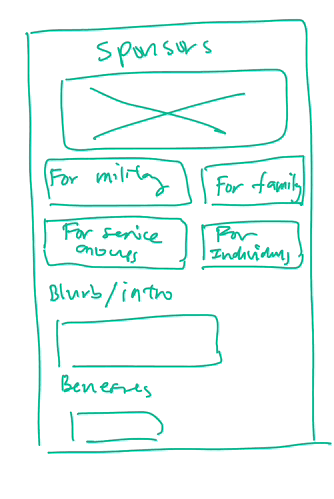
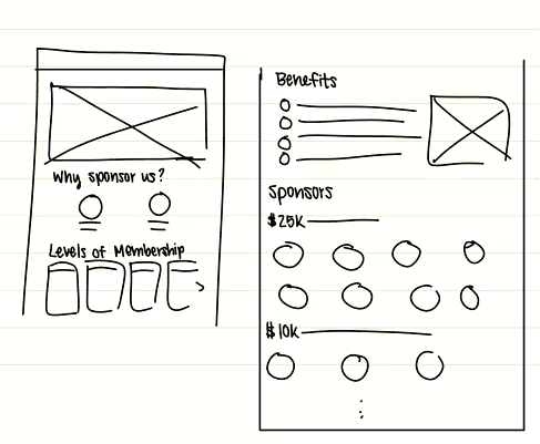
Rapid Wireframing.
Round 1
Round 2

Round 3
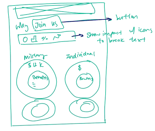

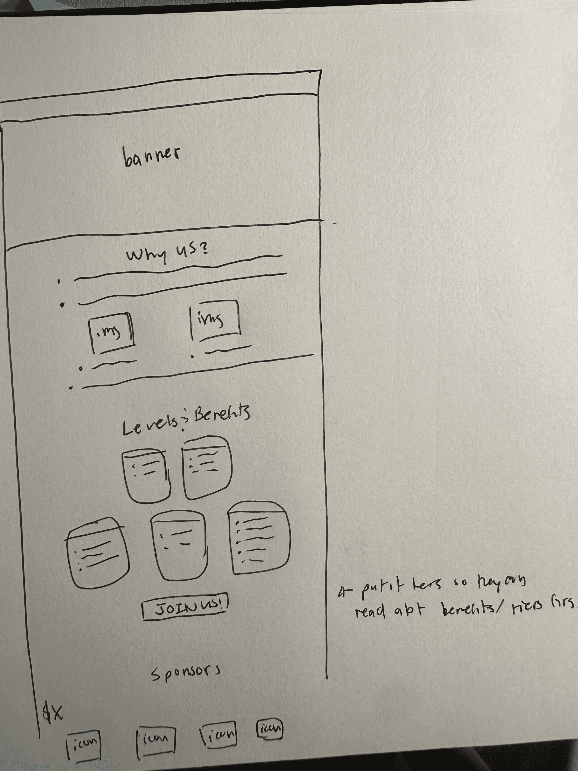

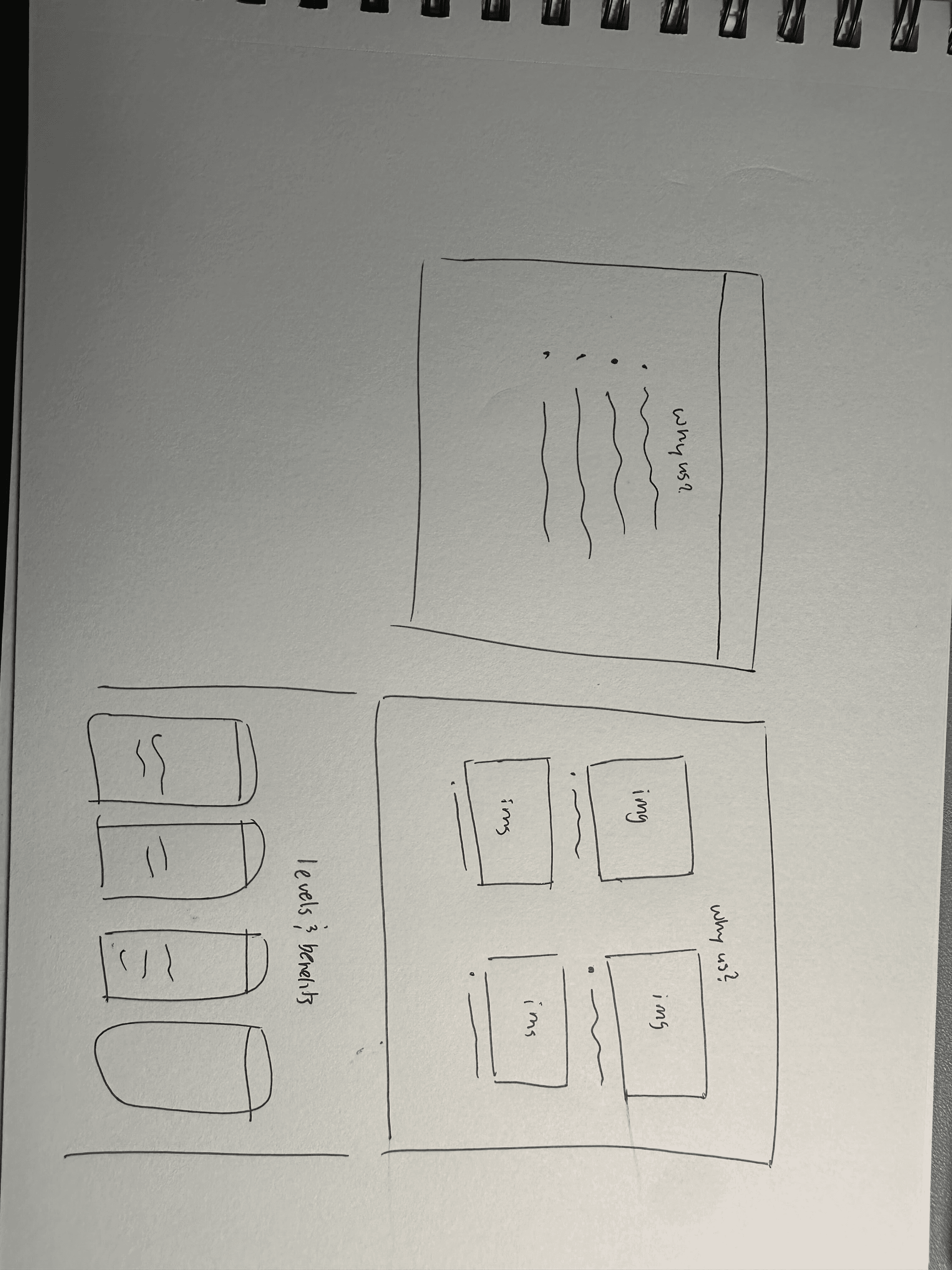
For ideation, we completed three rounds of rapid wireframing to refine our designs collaboratively, building on each other’s ideas and incorporating the best features into our low-fidelity designs.
WIREFRAMES
Low-Fidelity Designs.
Following our rapid wireframing session and insights from our competitive analysis, we created low-fidelity designs in three different formats to explore various features and layouts.
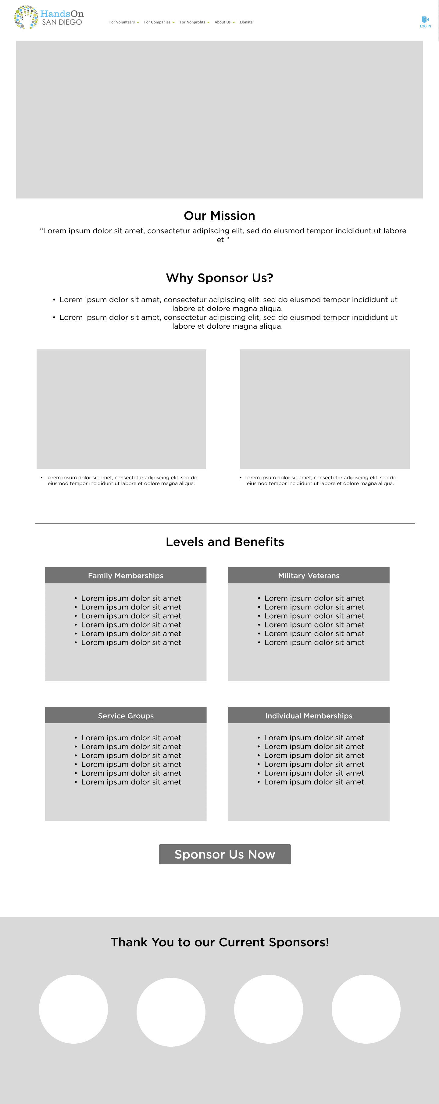
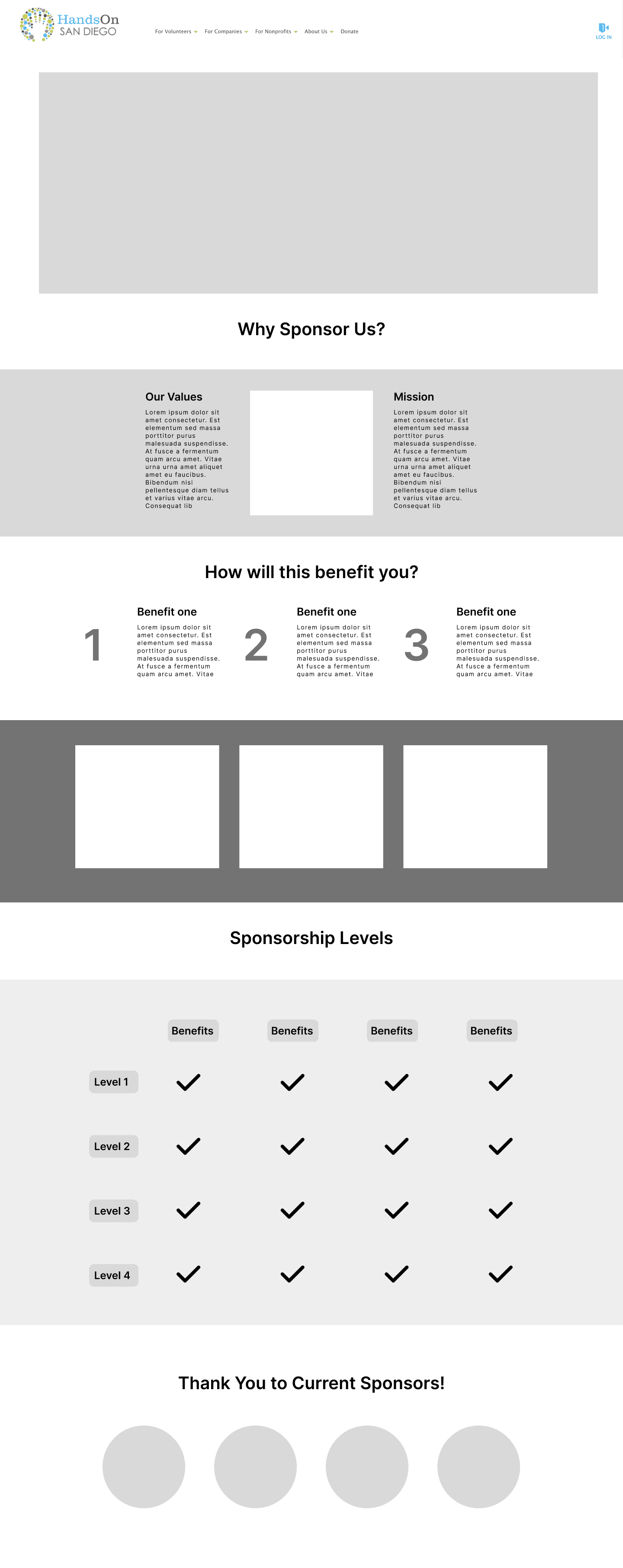
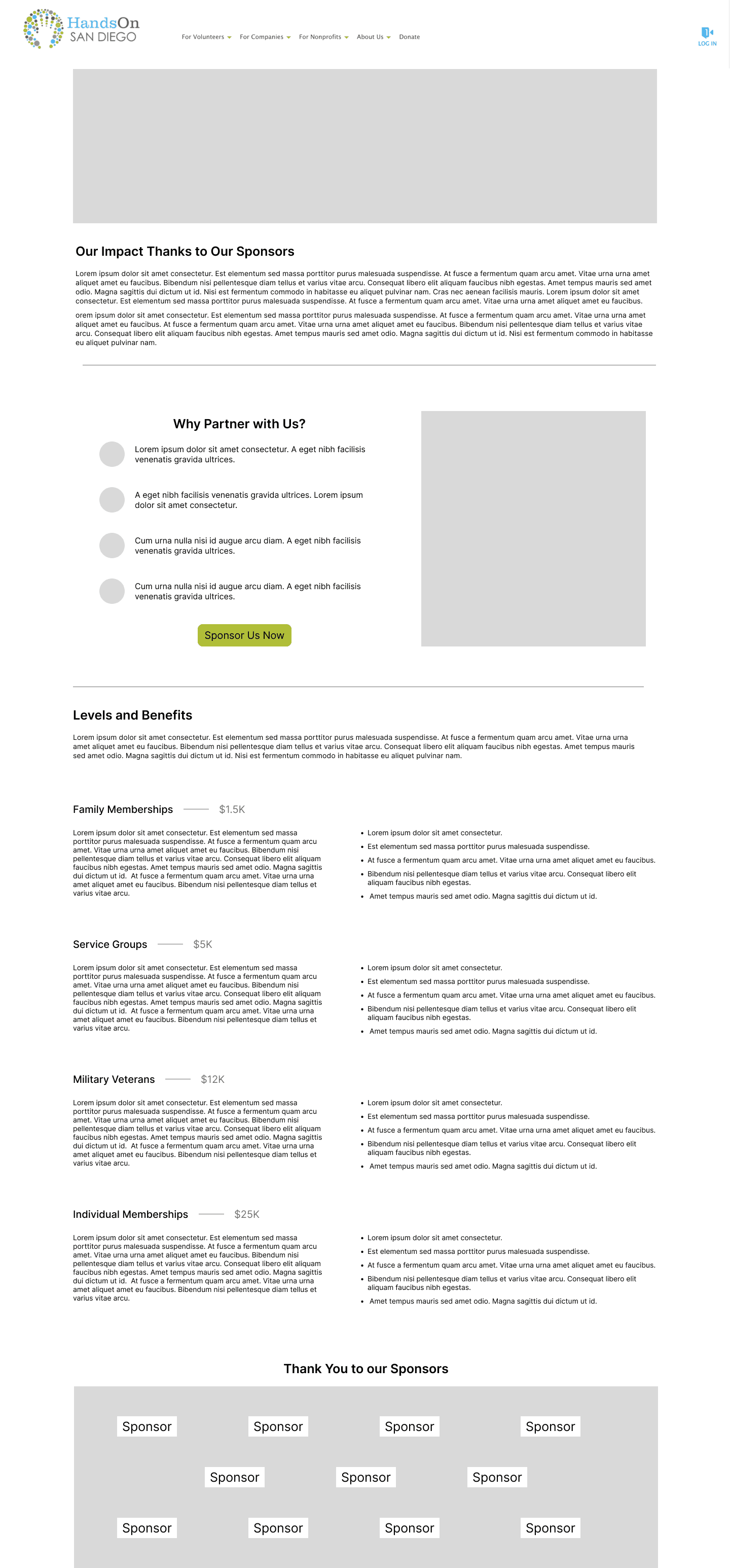
After these initial designs, we conducted a critique session to discuss and find ways to improve.
The features we liked from these three wireframes include:
Why Sponsor Us? Section: Provides a compelling introduction to sponsorship benefits and impact.
Card Layout: This allows for clear, easy comparison of sponsorship tiers, good for clarity.
Embedded Sponsorship Form: Reduces clicks by allowing users to fill out the form directly on the page.
The features we chose to exclude were:
Bubble Images: They appeared too cluttered. Need to exclude them to maintain a clean and professional look.
Mission Statement at the Top: To streamline content, we need to prioritize actionable content instead.
FURTHER ITERATIONS
Mid-Fidelity Designs.
Aligned the text and picture columns
Need to figure out if text is necessary
Card layout for clarity
Played around with text weight
Vertical text layout instead
of horizontal
More visual elements
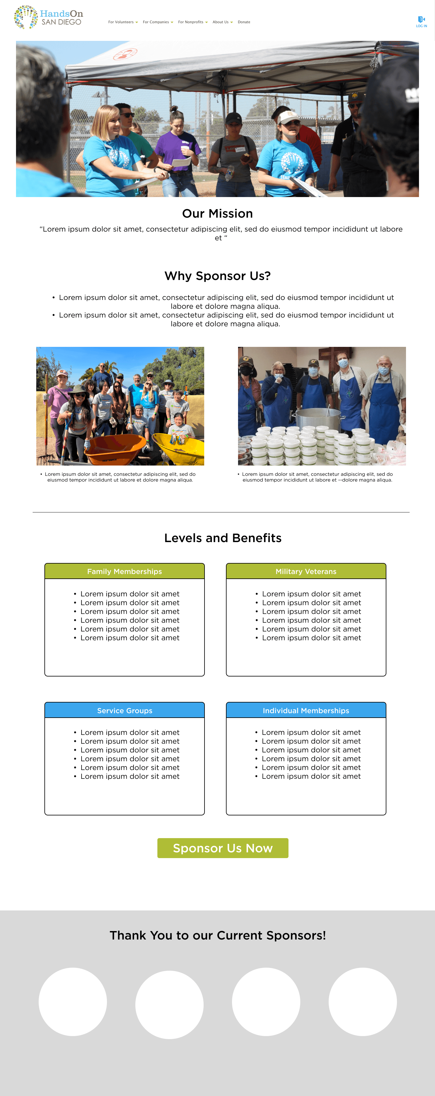
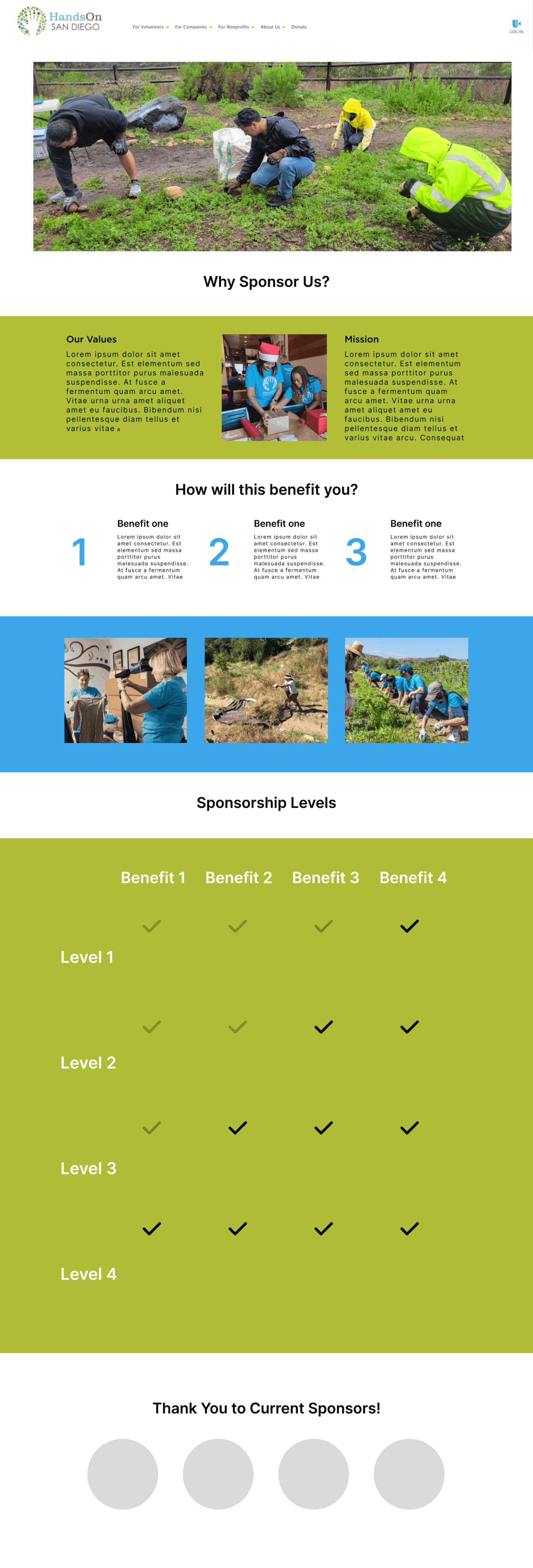
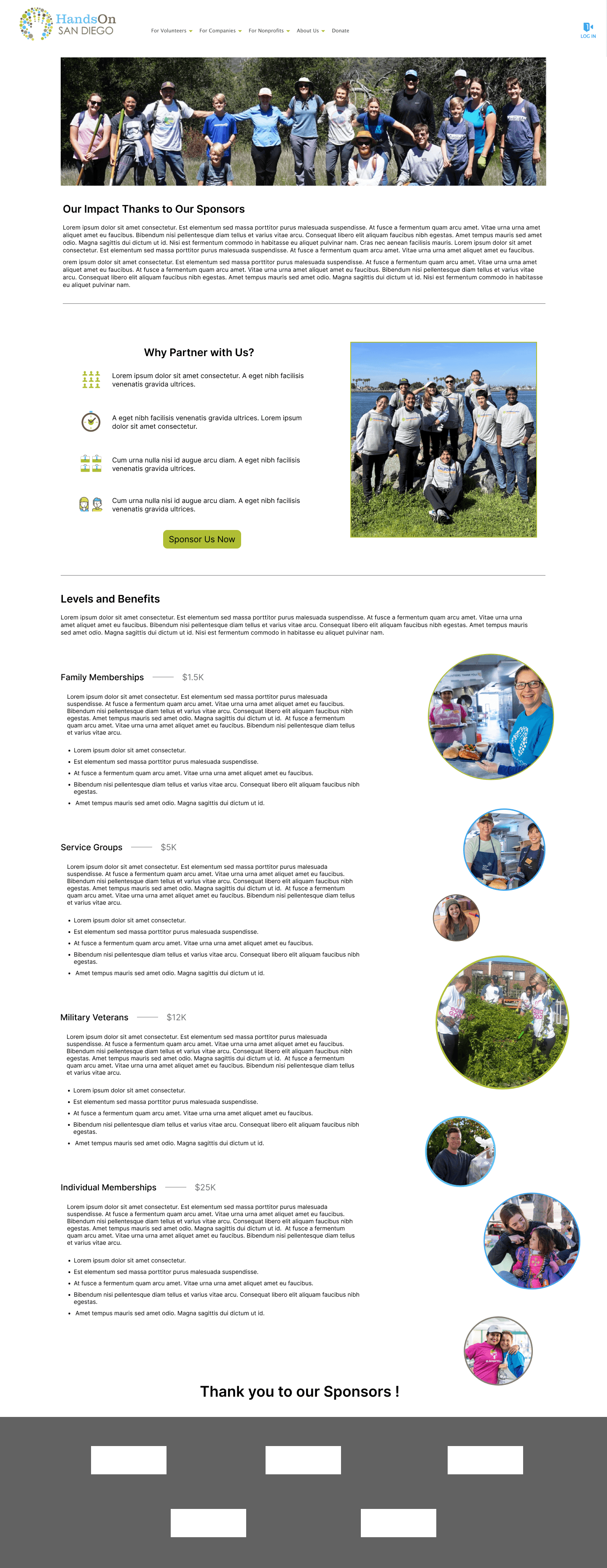
Through more design critique and feedback from our client, we identified key improvements in spacing, text distribution, and color blocking to enhance the readability and clarity of our designs in our Mid-Fidelity designs.
FINAL DESIGN
Implemented through CMS.
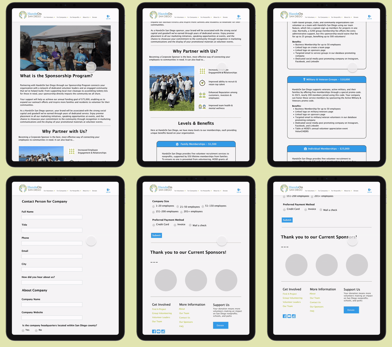
For our final High-Fidelity design, we identified the most effective elements to create an engaging sponsorship page and got approval from our client for implementation. My team and I got access to HOSD’s CMS platform and we launched our final design through there.

Our Finalized Sections
Header Section: Introductory blurb about the sponsorship program at the top featuring a large header image.
Why Partner with HandsOn San Diego: Key bullet points highlighting the benefits of partnering with HandsOn San Diego for businesses. Utilizing visual icons to brighten up the section and create engagement.
Levels & Benefits: Organized card layouts to display donation tiers clearly.
Cards for Organization: Embedded sponsorship form to minimize the number of clicks needed. Usage of icons and colors for better visual aesthetic.
Sponsorship Form: Included the sponsorship form directly on the page for easy access to potential donors eliminating unnecessary extra steps.
We also provided the final design to our client in a responsive format. We designed for laptop, tablet, and phone.


FINAL REFLECTION
Next Steps.
My team and I discussed volunteering with HandsOn San Diego and meeting our client in person. This would give us the opportunity to experience firsthand the impact of our designs and see how they are being utilized to support the organization's mission in real life!
What I Learned.
The Design Process Isn’t Linear: The first design is never the final design. Its important to receive feedback from the client and peers in order to consistently improve from previous iterations and revise designs based on feedback.
Important to Consider Feasibility: This was my first experience working with a client to bring my designs to life, and I learned a great deal about the differences between designing for a concept and designing for a live implementation. While conceptual designs allow for creative freedom, designing live requires balancing creativity with constraints like platform limitations, client needs, and technical feasibility. This experience taught me how to adapt, prioritize, and collaborate effectively to ensure the design meets both user and client expectations.
What I Would Do Differently.
If I were to do things differently, I would prioritize conducting more in-depth research to inform our design choices, particularly by gathering insights directly from HandsOn volunteers. Working under a strict timeline for the campaign page made it challenging to collect as much data as I would have liked. Additionally, I would have loved to implement more creative design ideas in the final launched version. This would have been possible with access to the source code, allowing us to move beyond the limitations of the CMS and Click & Pledge guidelines.
Thanks for stopping by!
Let’s connect & create a positive impact together :)
© 2024 Vivian Liu